DC's 2023 PARCC Scores
The non-state media version

DC just released 2023 PARCC results. We’ve heard:
“The District saw moderate increases in both math and ELA proficiency rates since 2022”
“While we still have opportunities for growth, rates of proficiency are nearing pre-pandemic levels. This is encouraging news!”
Let’s take a look, shall we?
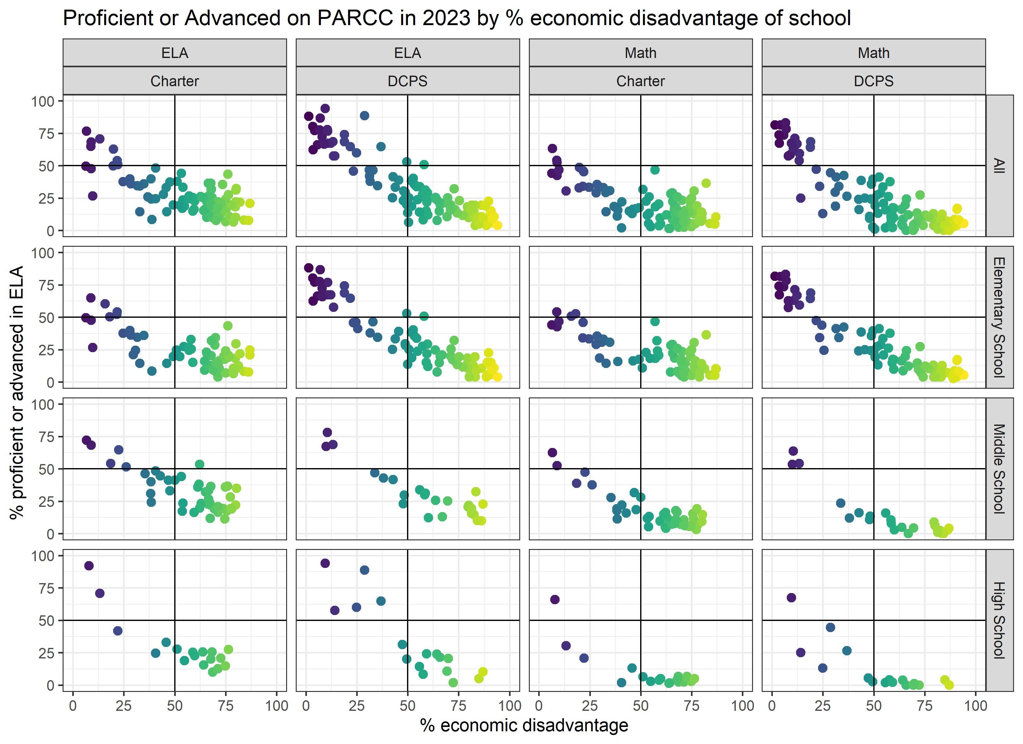
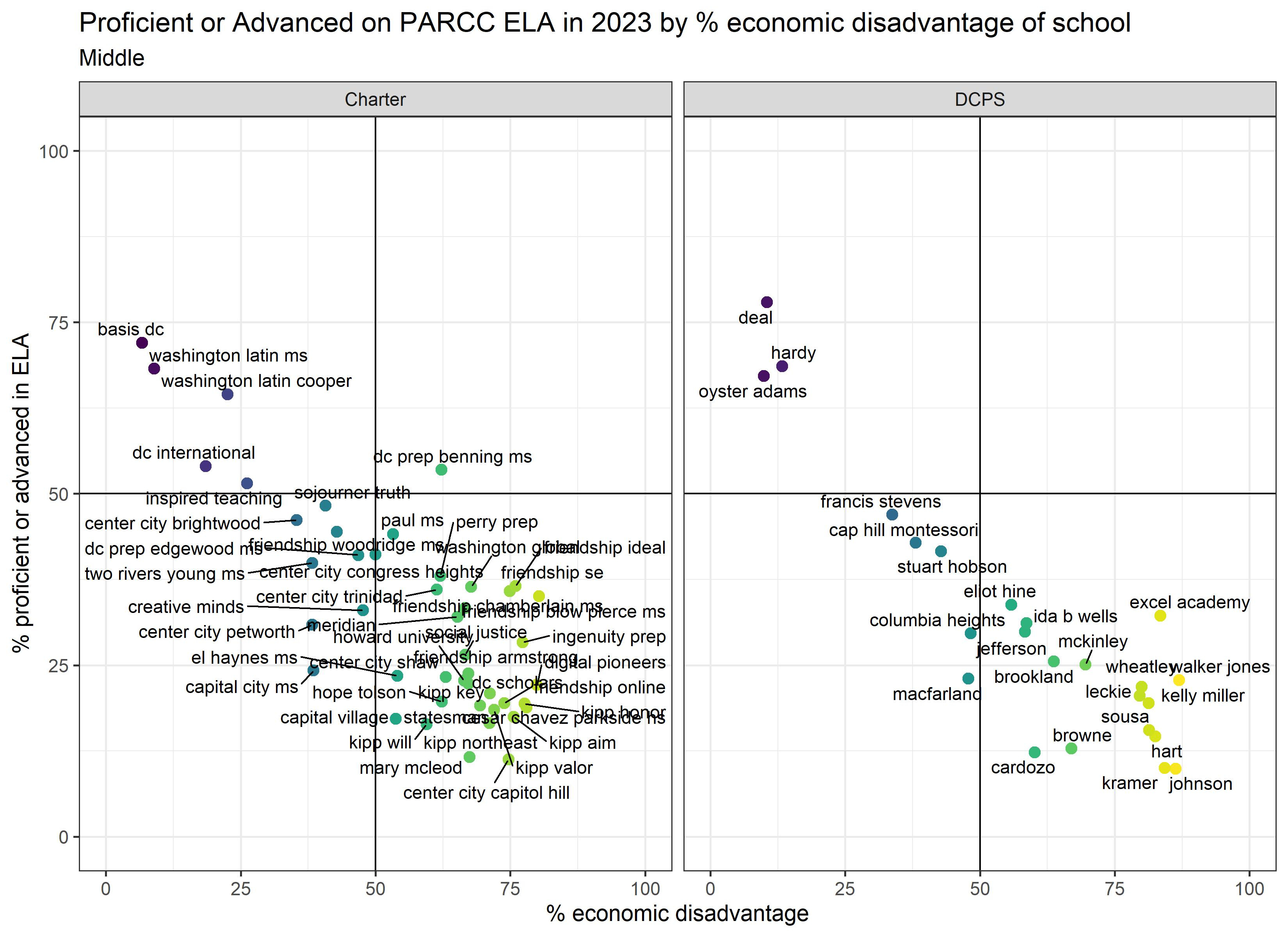
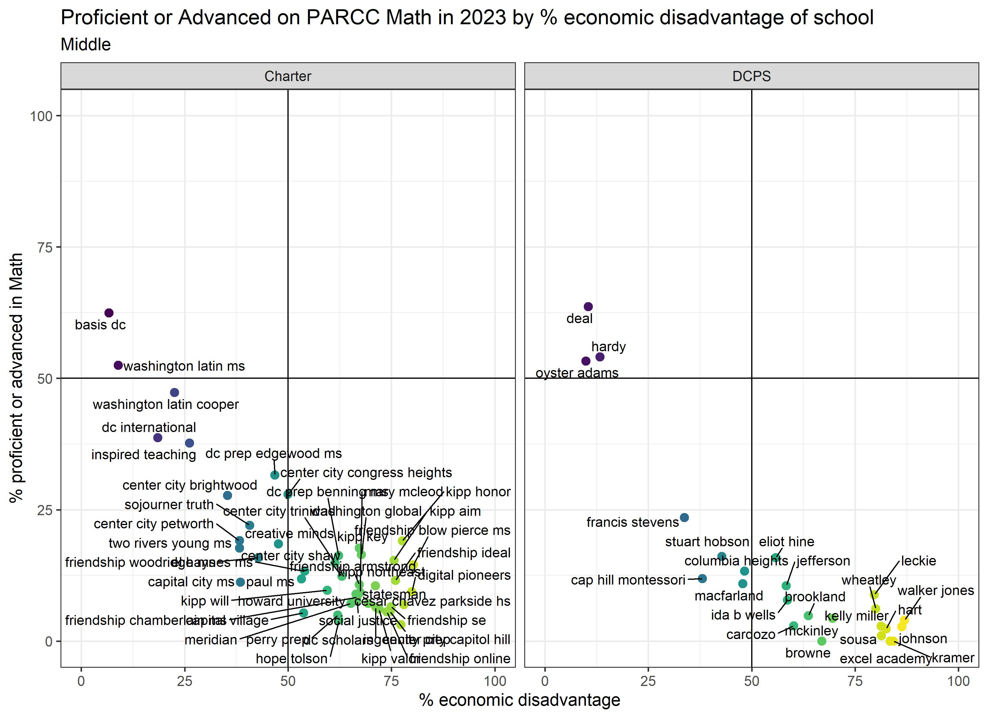
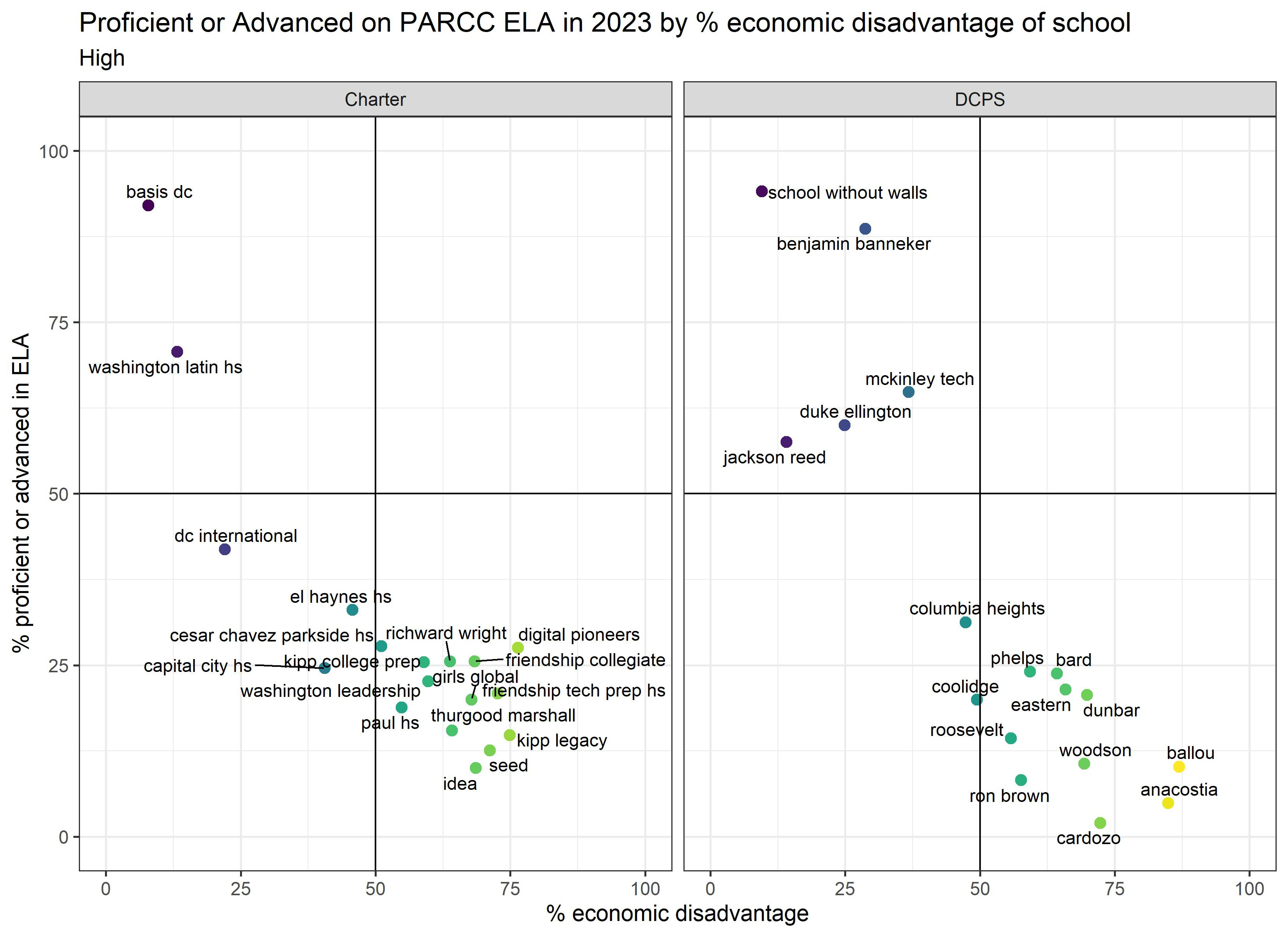
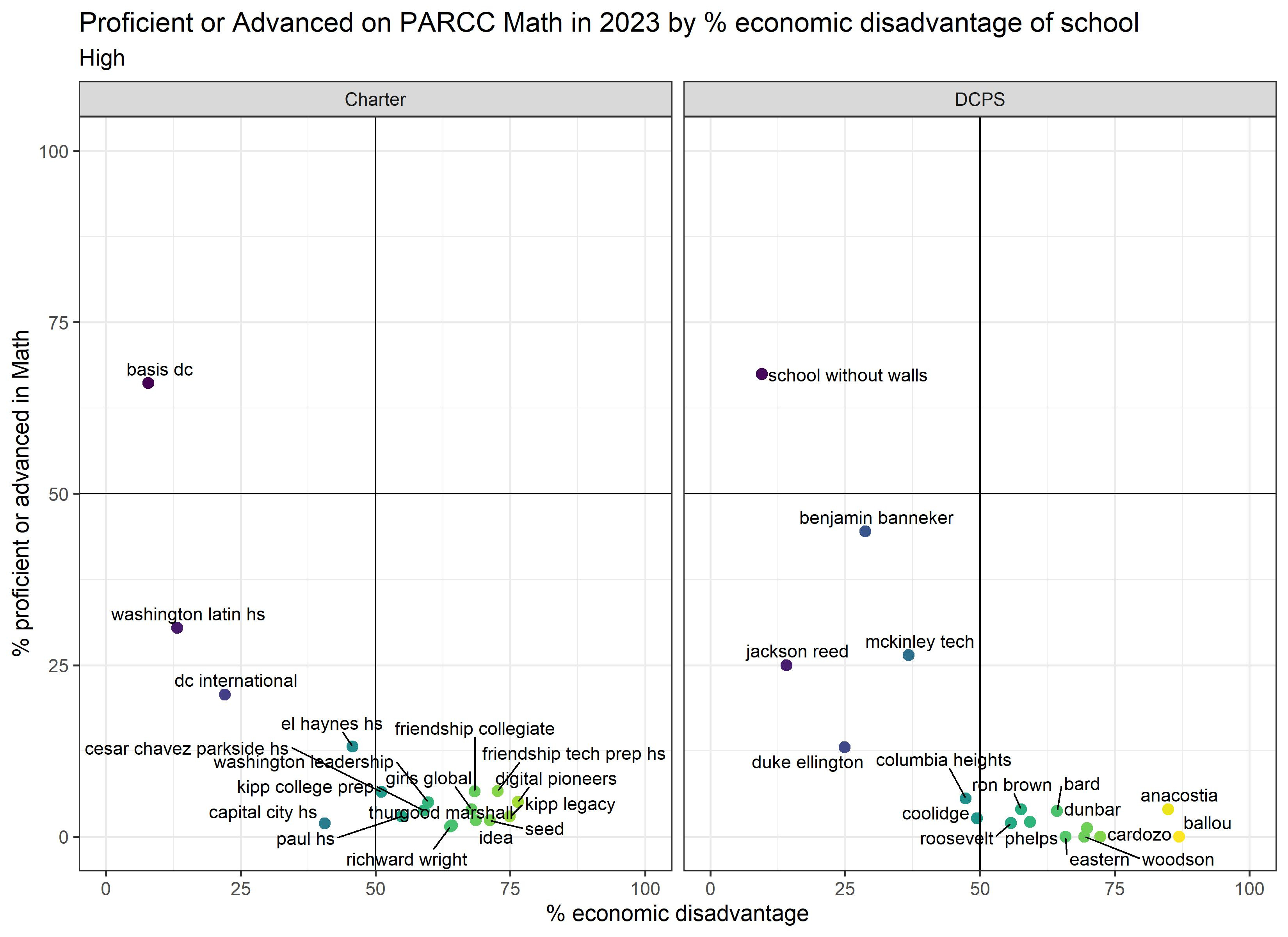
First, we see clear patterns where proficiency rates are very correlated with the economic advantage or disadvantage of the students attending the schools. In fact, student demographics (economic resources, native language, learning disabilities, race which is related to income inequality in DC) explain 82% of the variation in the proficiency rates in both ELA and math in DC. That means that only 18% of the variation in proficiency rates is explained by OTHER factors, including school quality. In case you are a visual learner, here you go:

What does this mean? This means that proficiency rates (and school ratings based on them) are telling us far more about who attended the school than about how much students learned while attending the school. To figure out how much students learned, you would need to consider the starting point, but proficiency rates don’t account for that.
This also means that, to the extent that we are equating high quality schools with high proficiency rates, we are equating high quality schools with those serving the most well-resourced students (see previous post on why I hate proficiency rates so so much).
Second, the top right quadrant shows the schools (or lack thereof) serving >50% economically disadvantaged students where >50% students were proficient. Schools, by themselves, cannot solve all societal ills and address underlying needs, no matter how much we want that to be true. At least it’s not happening in DC.
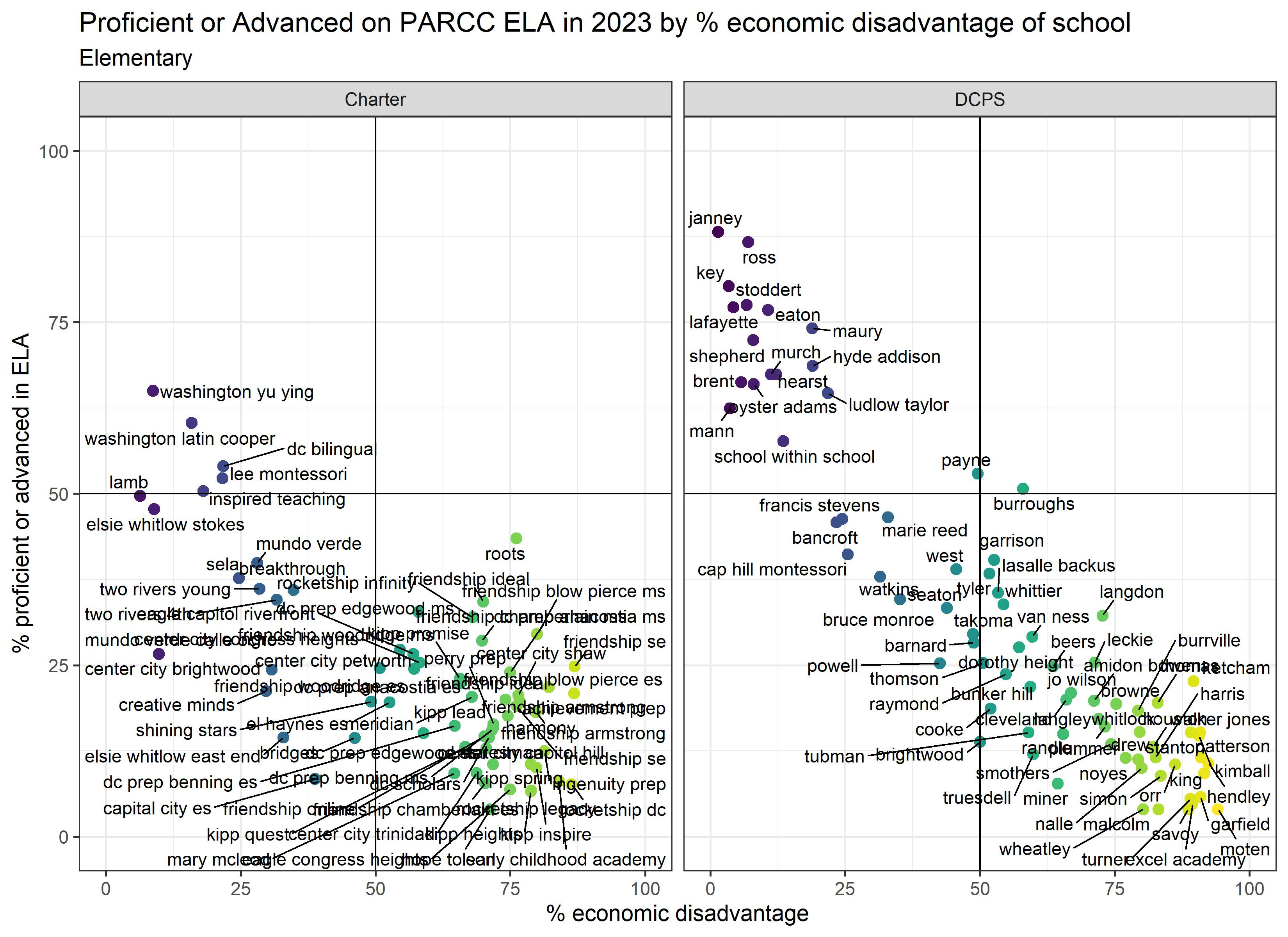
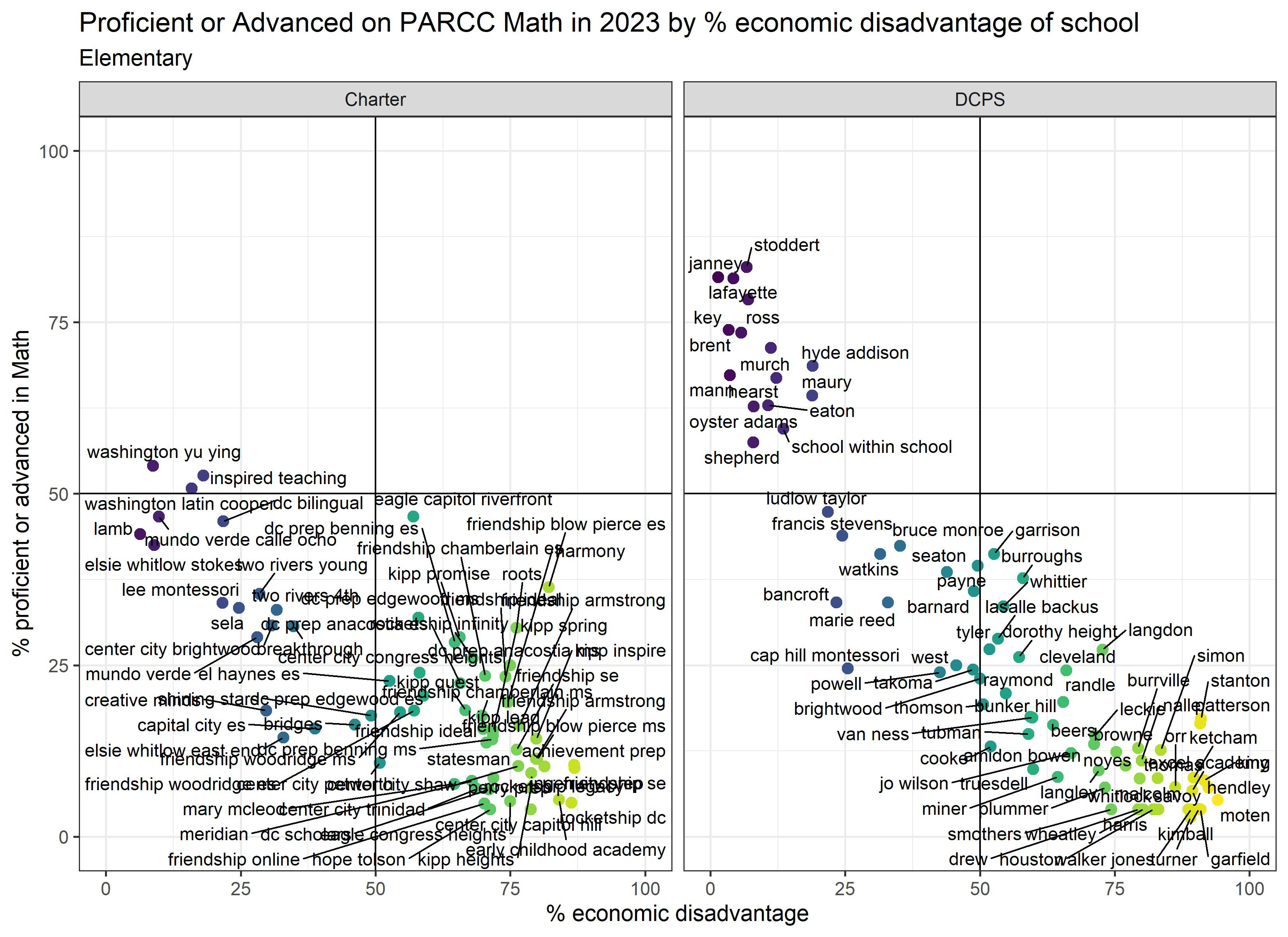
Third, I would caution against giving schools awards for “beating the odds” and doing a better job than schools serving students with similar demographics:
1. Proficiency rates depend on how many students were near the cutoff for proficiency. If one school has students just below the cutoff, and another school has students just above the cutoff, there’s essentially no difference in achievement BUT the proficiency rates will look very different for these two schools. (The same thing is true anytime you have an arbitrary cutoff point.)
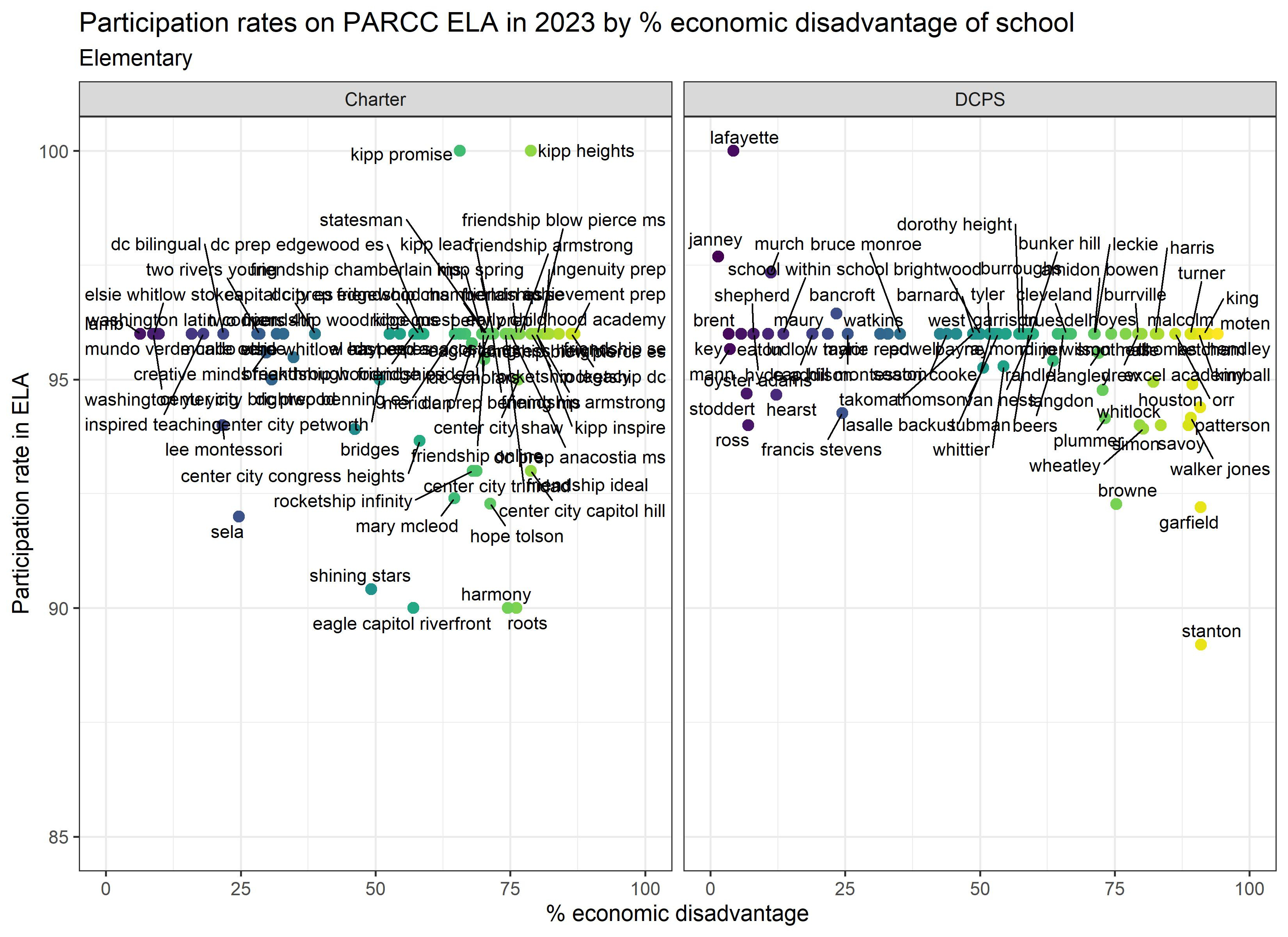
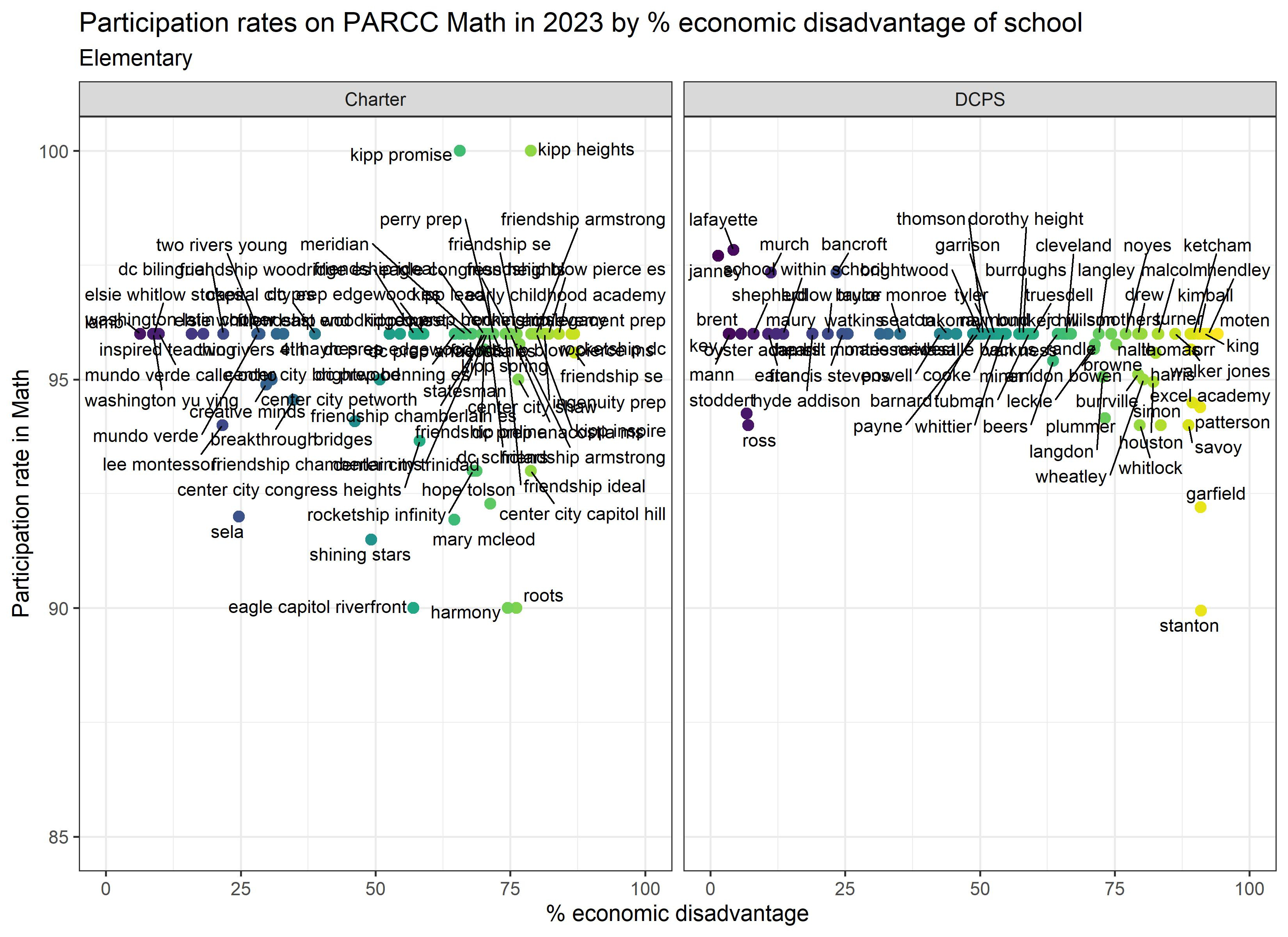
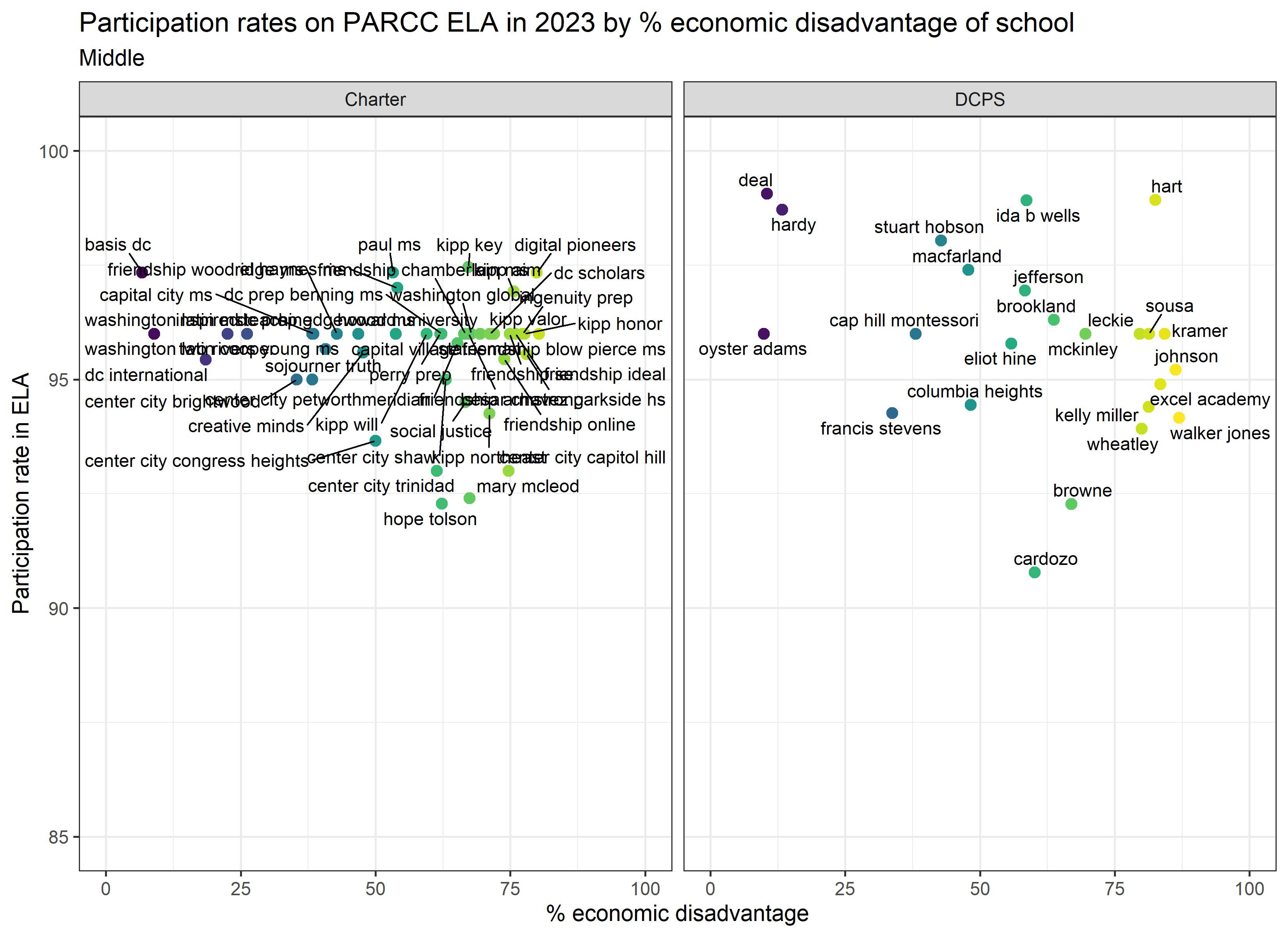
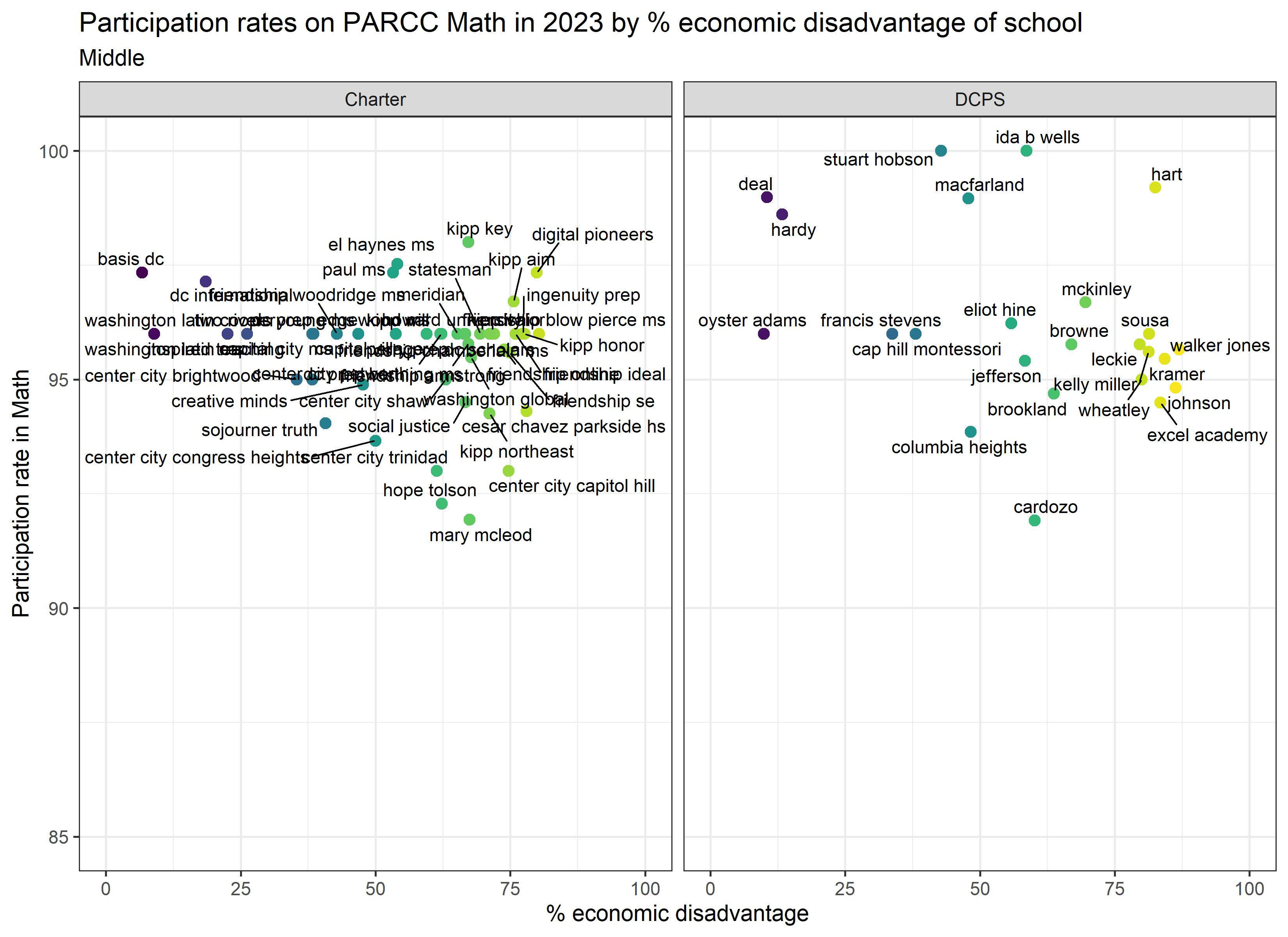
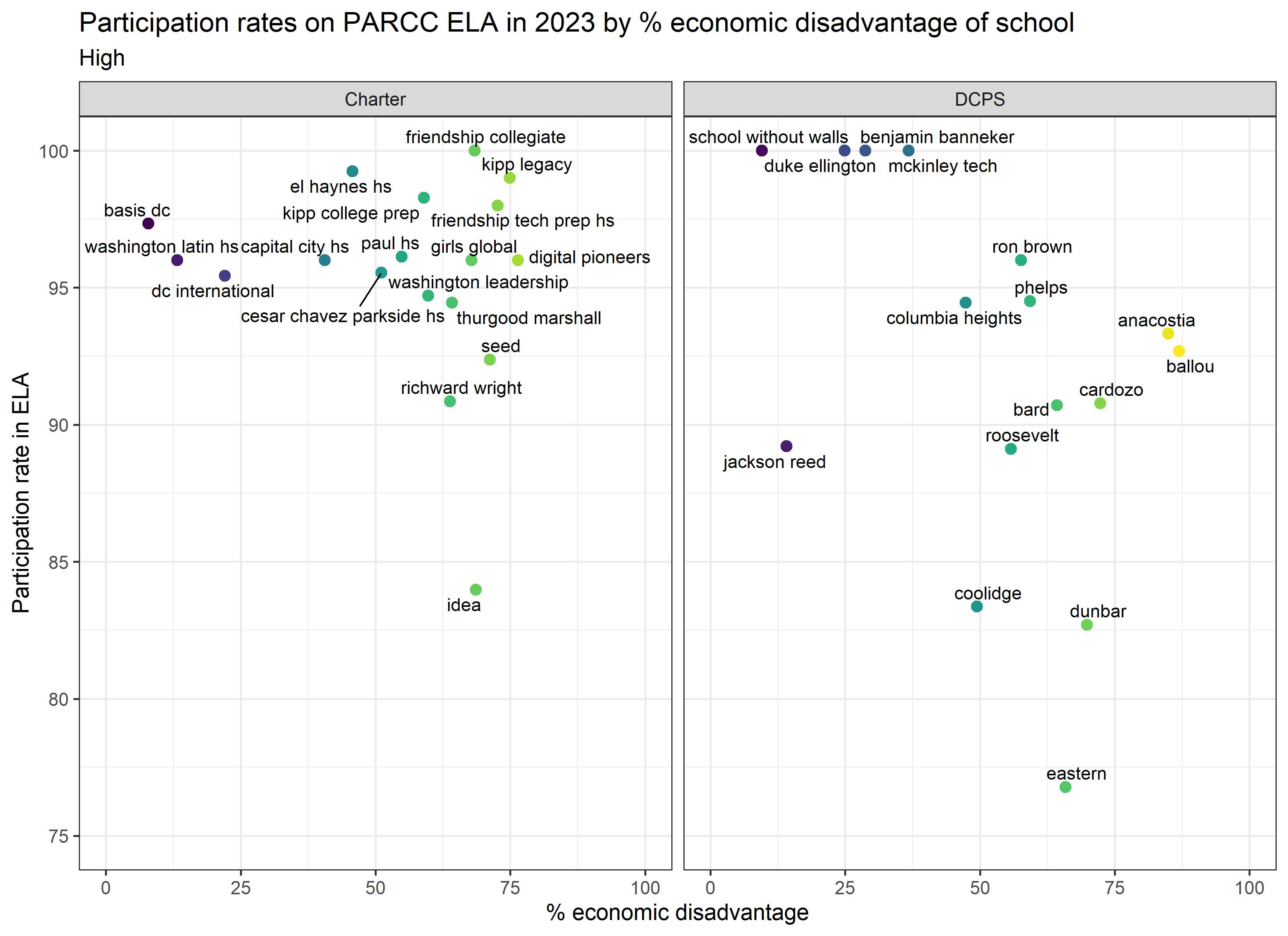
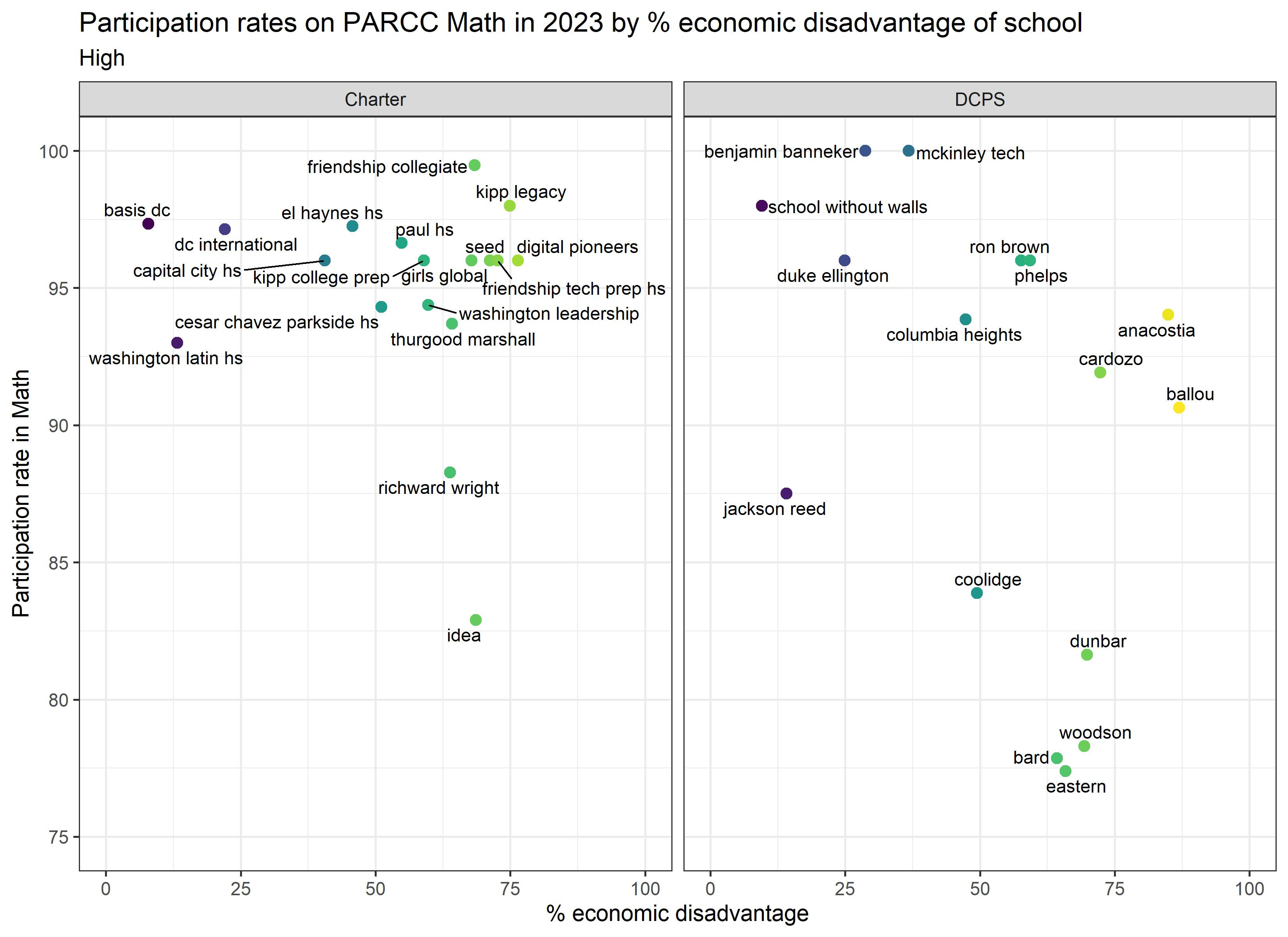
2. You might also want to consider the test participation rates for the schools that stand out. Are their test scores higher because more students were proficient, or were they more selective in who took the test?
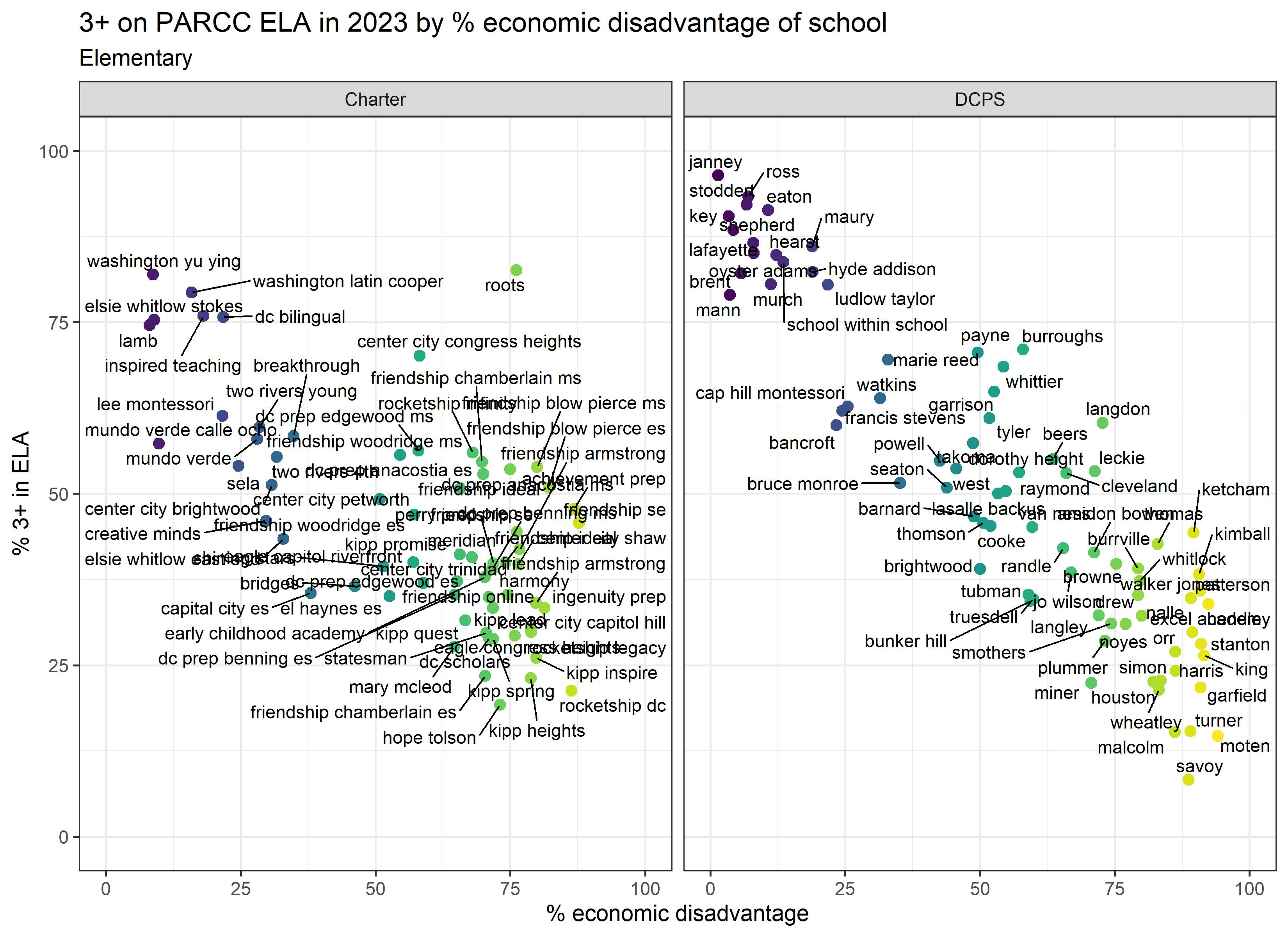
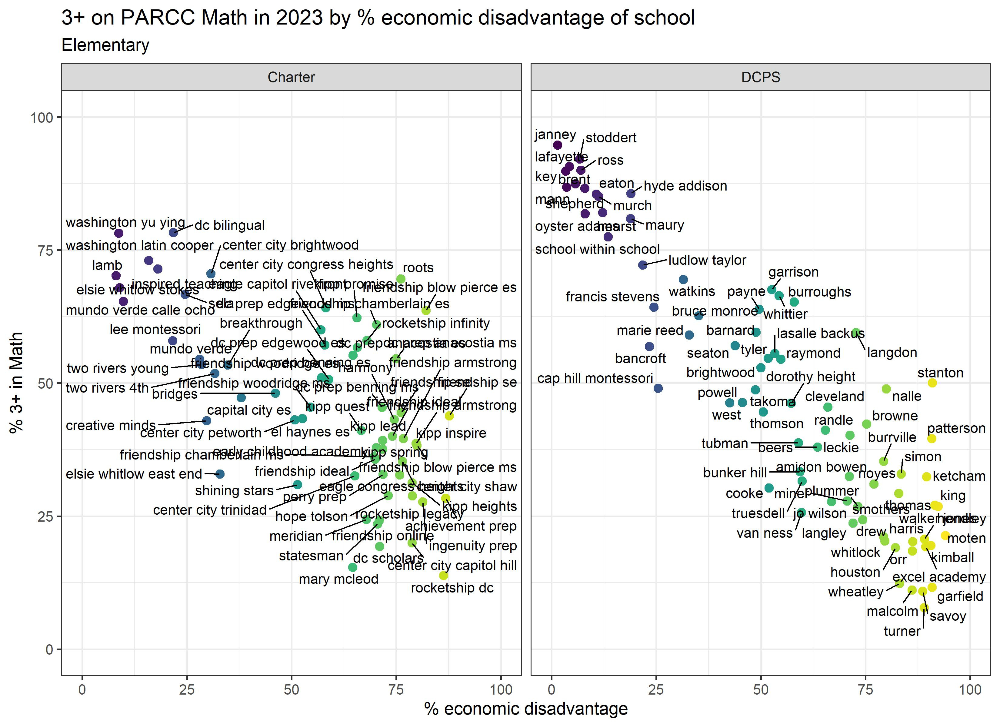
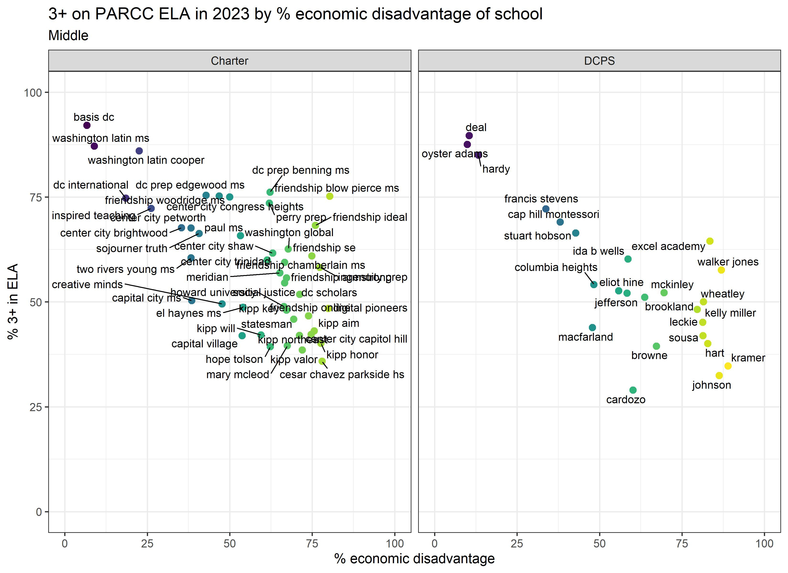
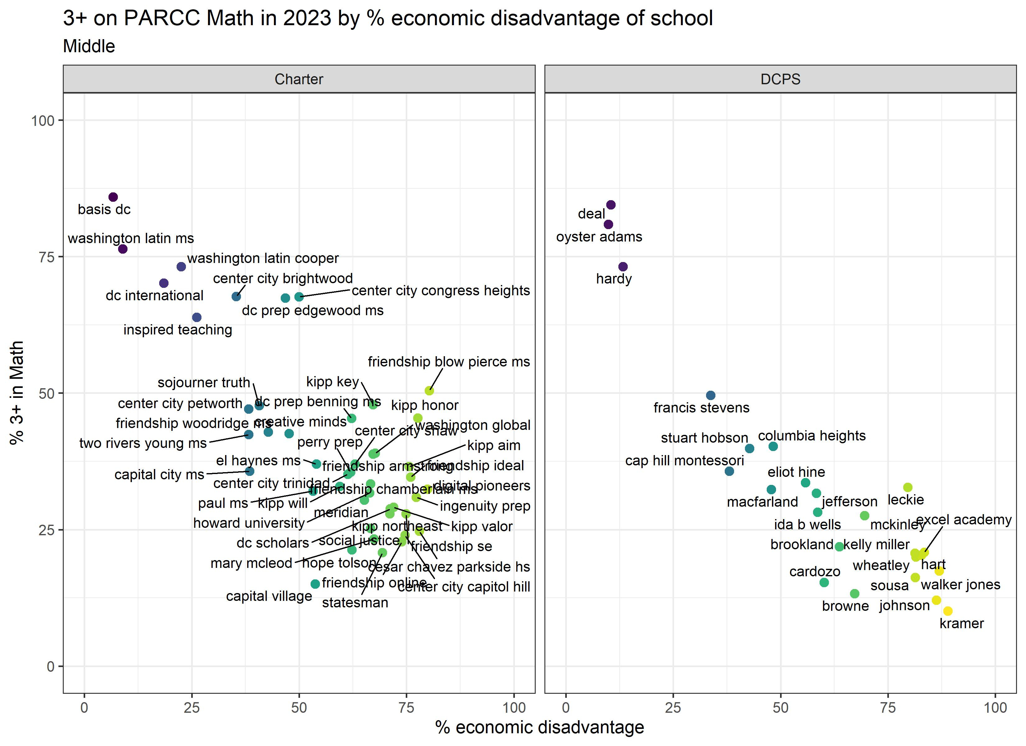
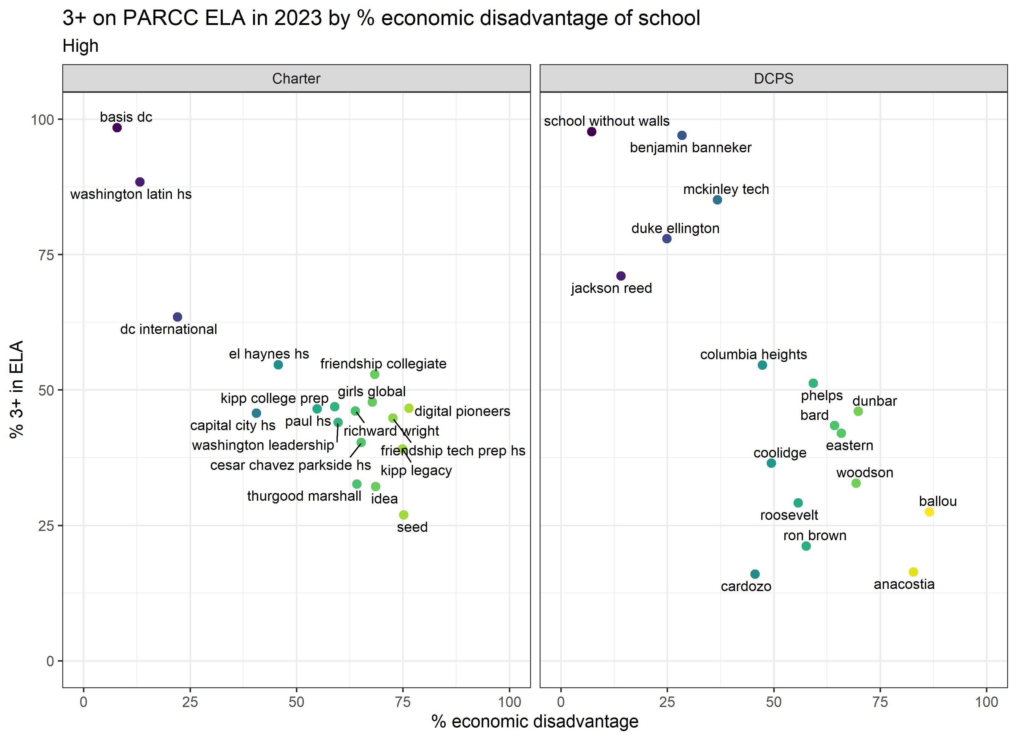
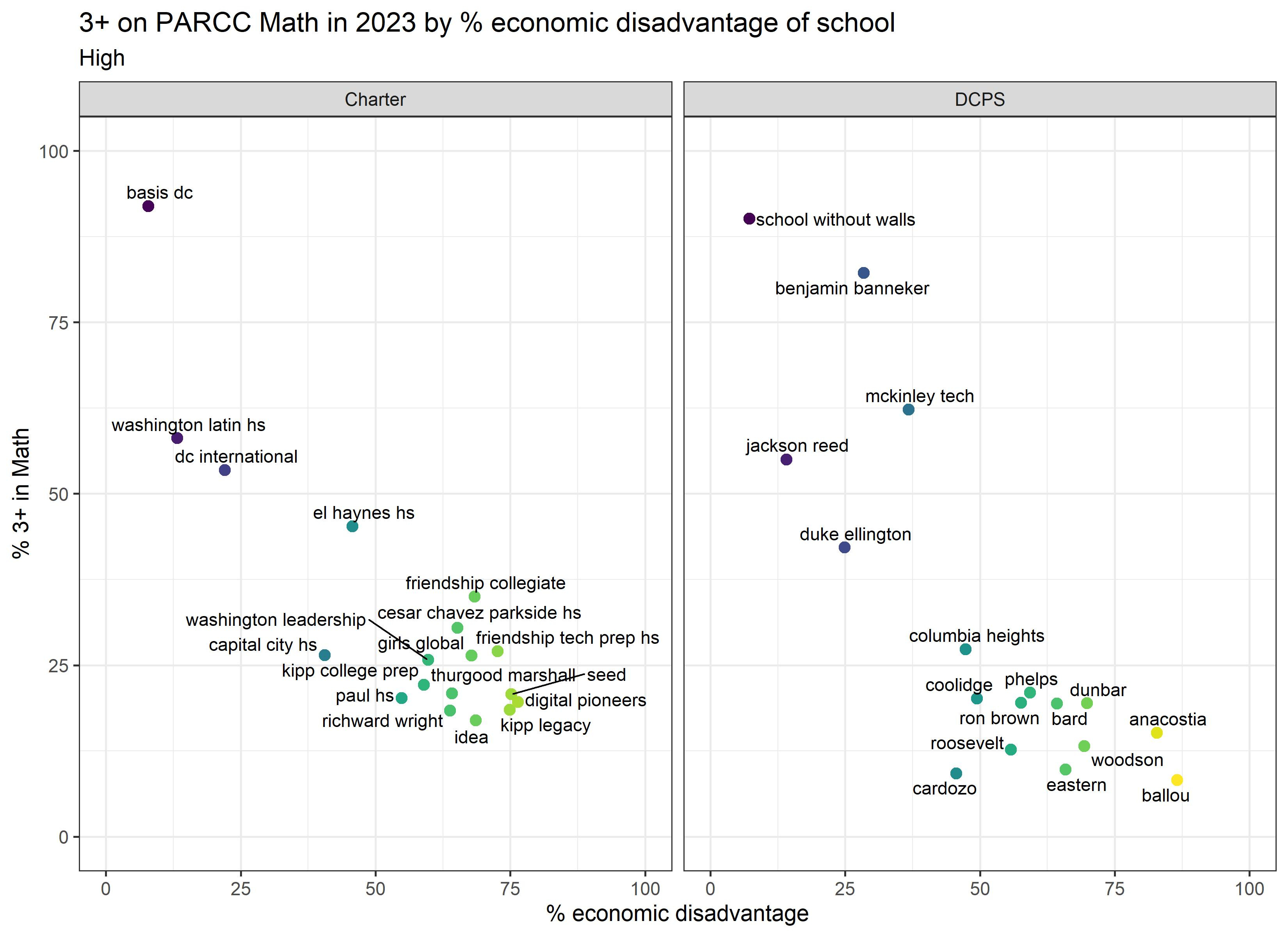
Here are the same graphs for middle schools. Some schools might be included in both the elementary and middle graphs, if they serve both elementary and middle grades.
And here are the same graphs for high schools. Some schools might be included in both the middle and high graphs, if they serve both middle and high grades.
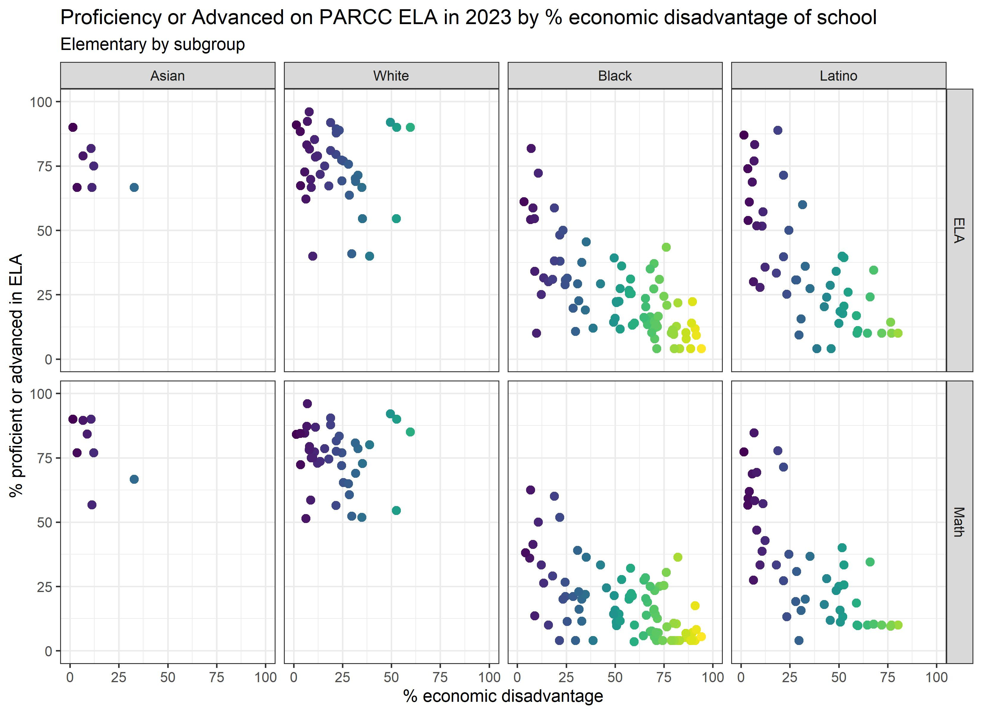
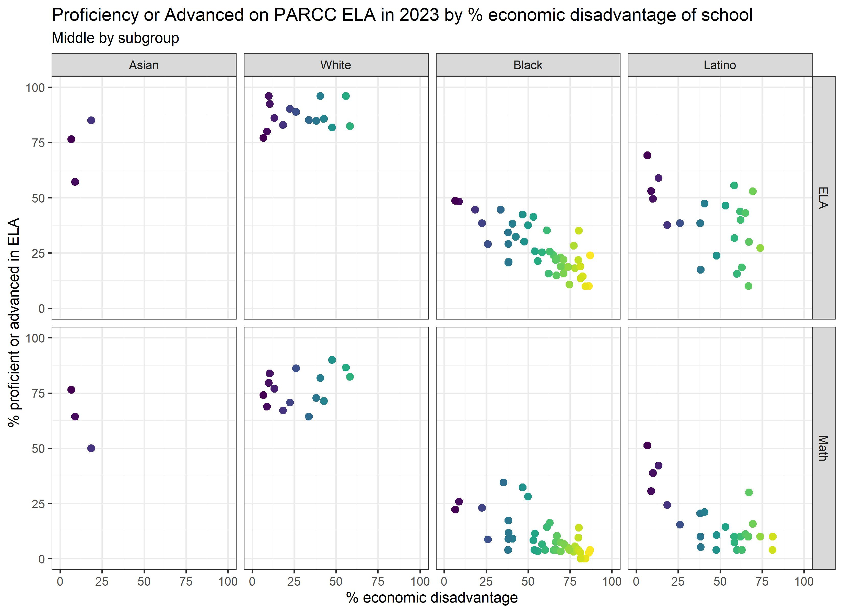
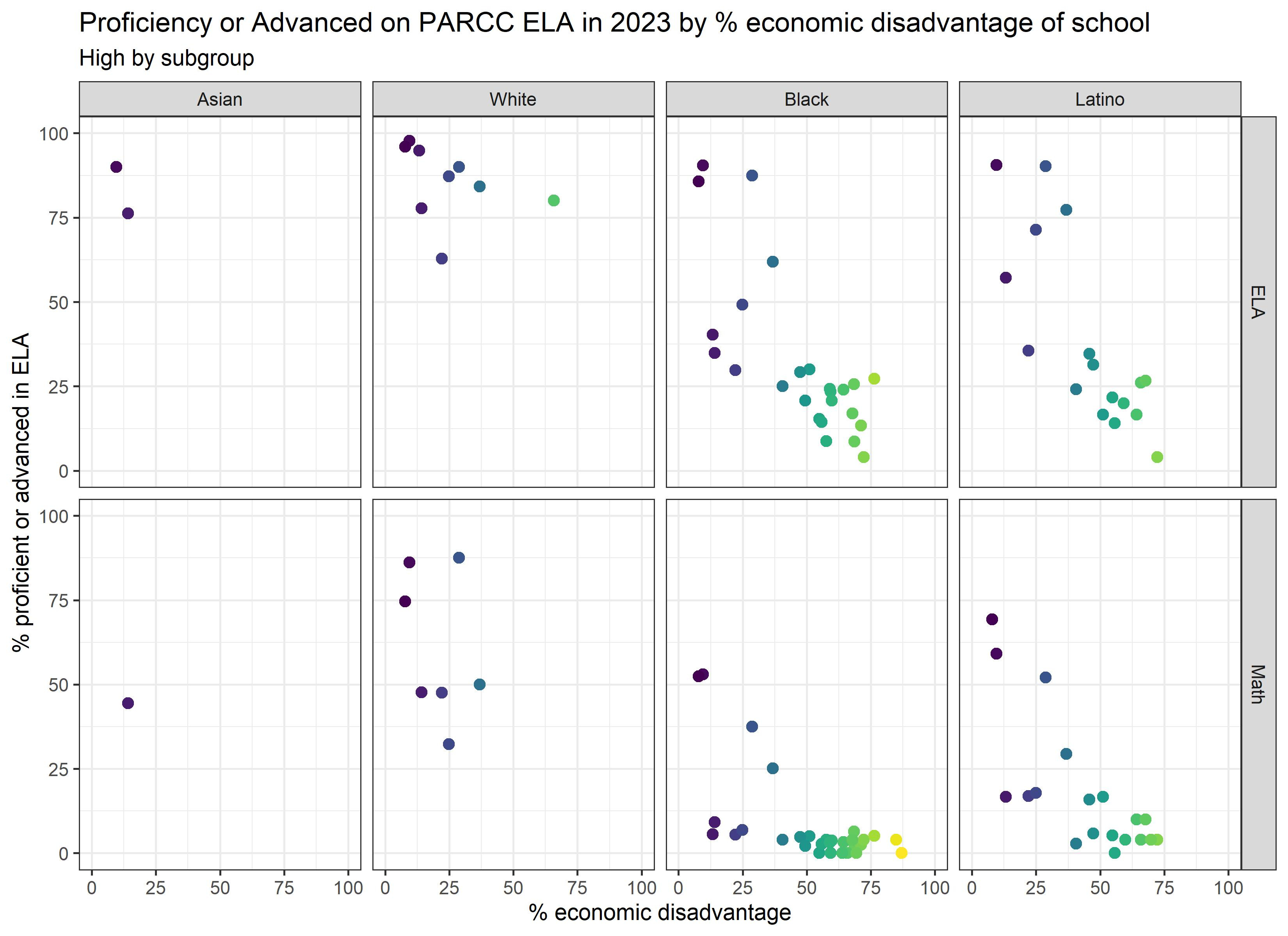
Now let’s look at proficiency rates for different subgroups of students. OSSE suppressed much of the data (see data notes), so we don’t know how various subgroups are doing at each school. But we can still look at overall trends. Keep in mind that subgroup proficiency rates have even larger margins of error due to smaller sample sizes, so I wouldn’t get attached to any one dot.
Looking at the economically disadvantaged (or not), homeless, students with disabilities (SWD), and English learner (EL Active) subgroups, we generally see the same patterns as before, where students in each subgroup have higher proficiency rates in schools serving a higher percentage of well-resourced students. Why is this? Could it be that the schools serving the most well-resourced students have the best resources, and as a result, students learn more? Or is it that students who live in or commute to the wealthiest parts of town are systematically different than those who don’t? Or, could it be some combination of the two?
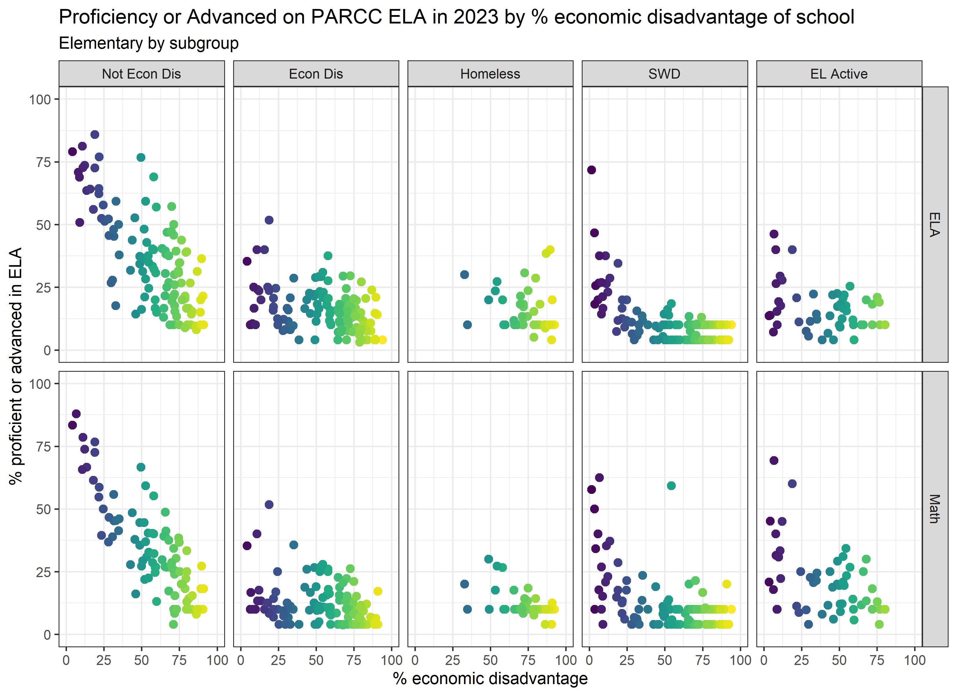
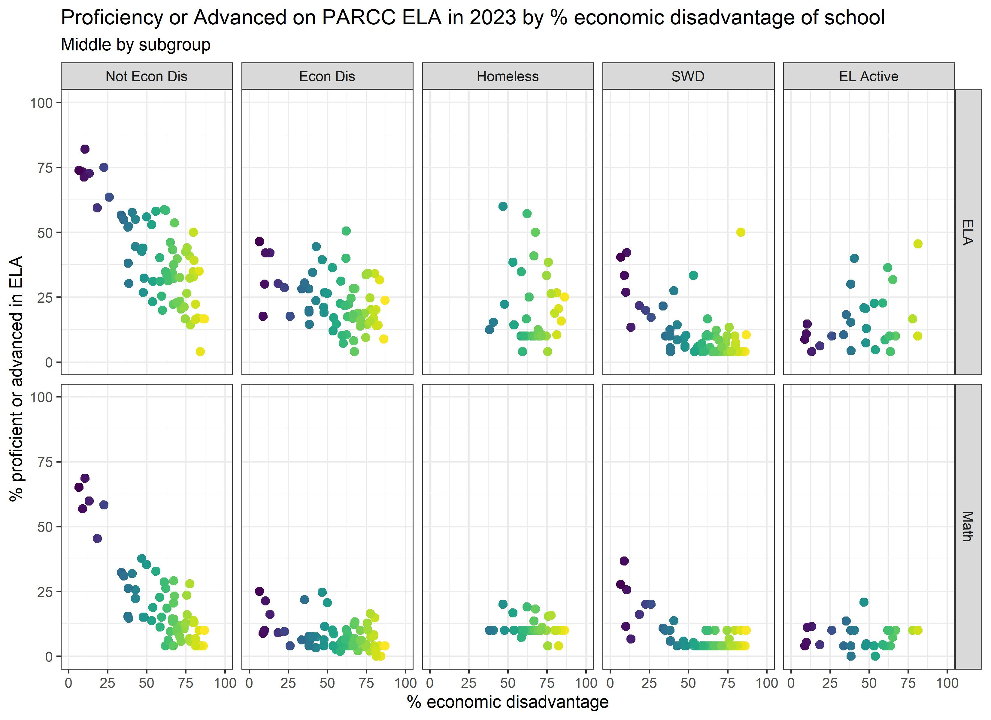
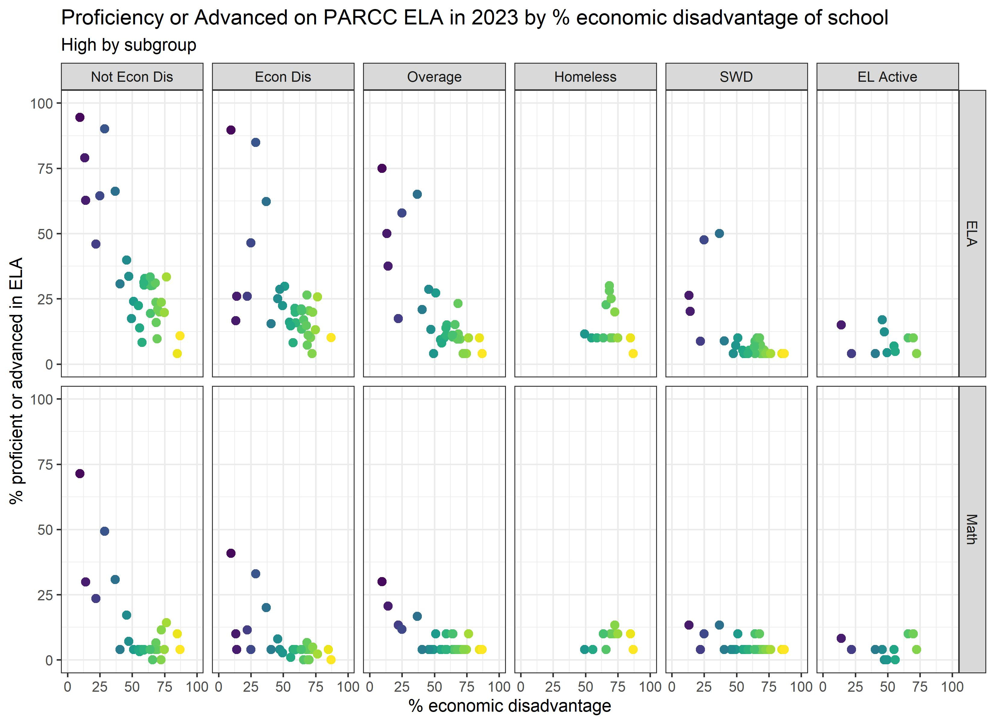
Some of the subgroups – homeless, EL Active, white, and Asian - provide some evidence that it’s NOT simply the case that schools serving the most well-resourced students are those where students learn the most. Looking at these subgroups, there isn’t as much of a downward trend in some cases, and no trend in other cases. This is consistent with prior research showing that students bring their existing privilege and challenges to schools, and these things affect learning outcomes, regardless of where they go to school.
THIS IS NOT ME SAYING THAT SCHOOLS DO NOT MATTER. Schools matter a great deal and can be gamechangers for some students. But we should be honest that proficiency rates aren’t telling us much (anything?) about the schools where students learn the most.
These graphs also really hit home that white and Asian students rarely attend schools serving a majority of economically disadvantaged students. (If there were less than 10 in a grade in a subgroup in a school, OSSE suppressed the data.) We already knew this was true, but it’s just sad looking at the graphs.
Finally, overall, we see the same patterns in math and ELA. We also see the same patterns for students who are “meeting or exceeding expectations” (4+ on PARCC) and for students who are “approaching, meeting, or exceeding expectations” (3+ on PARCC). Student demographics explain 72% of the variation in “approaching, meeting, or exceeding proficiency” in both ELA and math. This means that focusing on more than just reaching proficiency is slightly less correlated with student demographics, but student demographics still explain the vast majority of the variation. The 3+ graphs are included at the end of this post.
Don’t miss the data notes at the bottom, if you’re into that kind of thing.
Next up: In light of the graphs above, can we talk about what you mean when you say your child is attending a diverse school?
Data Notes:
1. The biggest loss relative to what OSSE used to produce is that they don’t show us the percentages of students at all the achievement levels (level 1, level 2, level 3, level 4, and level 5). Instead, we get information about students near or above the cutoff, but we get no information on the larger distribution of scores. Will OSSE please bring that back?
2. I know data confidentiality is a concern, but I fear that OSSE is so focused on people not being able to figure out exactly how many students were proficient, that they forget that the data are supposed to be useful to the general public. It’s not possible to know how some schools are doing because OSSE suppressed the proficiency data. They have suppressed 56% of the rows in the “Meeting, Exceeding” tab, which means they’ve providing no achievement information whatsoever on half the entries in the spreadsheet. As an alternative, OSSE could do what some federal data sources do, and that is, make a few minor changes to the data such that it doesn’t change any of the relationships but some data entries would not be exact, which prevents identification.
What’s worse is that they’ve provided rows and rows of subgroups for which there is NO data for ANY school (see Native American and CFSA). They might as well add a unicorn subgroup, which will be all missing as well.
3. So much of the demographic data on the test takers are also suppressed. In these cases, I pulled it from the 2022-23 enrollment files. This requires manipulation of data, which is too much work for general audiences. When I can, I use the demographic data for the test takers (as opposed to enrollment) because it’s more relevant to the proficiency rates.
On that note, when you run a regression of the percent proficient on the student demographic variables, there are no results because every school and subgroup is intentionally missing at least one value. This is almost like OSSE is trying to prevent people from (easily) figuring out how much student demographics explain the results. Please don’t make us use maximum likelihood with multiple imputation, OSSE!
4. I preserved as much information as I could. For example, if the Percent said “<5%”, I used 4%.
Additionally, I think there are errors in the data. I think OSSE means “DS” when they say Percent=”<10%” in the Participation tab.
5. Since so many of the counts were missing in the Participation tab, and OSSE did not participation rates for all grades, I used the average participation rate across the grades with non-missing participation rates.
6. Don’t love how I had to filled in the missing gaps in the data? Then provide the data so I don’t have to!!!
7. There are likely errors, as I am doing this as an unpaid volunteer. If you find one that confuses the results, let me know, and I’ll correct it.
Graphs using 3+ instead of 4+ on PARCC: