The metrics behind OSSE's school ratings

The state education agency in DC, OSSE, released the data for each metric used to determine their new school ratings. I wrote about the ratings here. Previously, I found that the ratings appeared to be too low for DCPS schools relative to charter schools, when accounting for the differences in student populations served. This is largely because OSSE doesn’t account for differences in student populations across schools when calculating ratings, which benefits charter schools more than DCPS schools. We can see the differences in student populations clearly in the metric data.
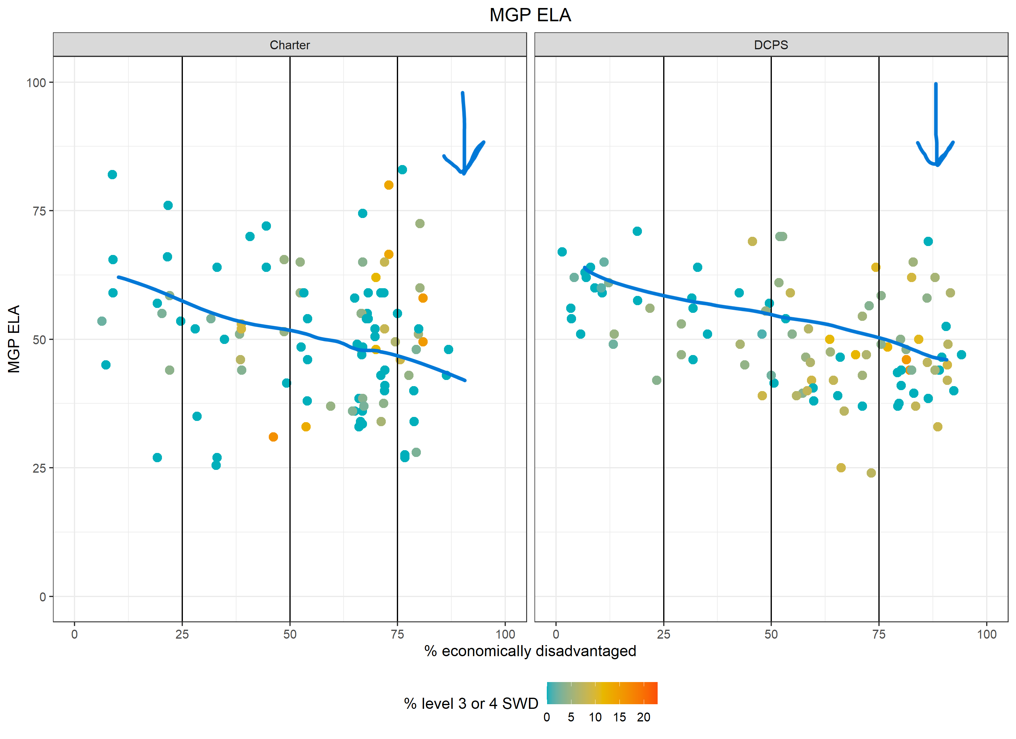
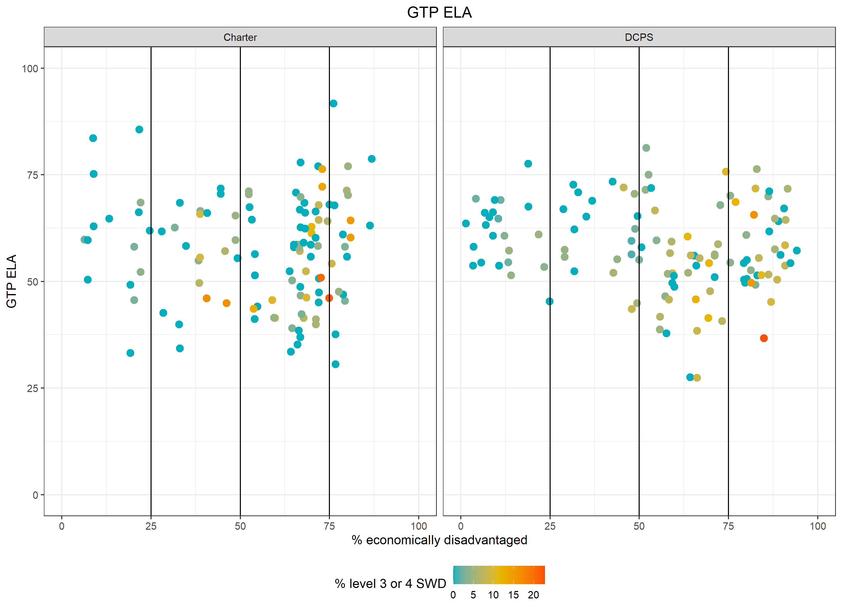
Take a look at the median growth percentile (MGP) in English language arts by the % of student economic disadvantage below. First of all, notice the relationship between the % of economically disadvantaged students and lower growth scores. To compare across sectors, look at each vertical slice of % of economic disadvantage. While MGP is known for being very unreliable (so take the values with a grain of salt), you can see that there are few charter schools that stand out as having higher growth than DCPS schools in each slice, but you also can see much more variation in the charter sector than in DCPS. Last, it’s obvious that DCPS has many more schools with concentrated poverty, and for schools with more than 50% economically disadvantaged students, DCPS serves students with higher levels of special education needs (as shown by the greenish and yellowish color). So while there are clear differences in student populations across the sectors, OSSE doesn’t account for this, making ratings look worse for DCPS schools than for charters, relatively speaking.
Growth: PARCC median growth percentile (25% of school ratings in ES and MS)

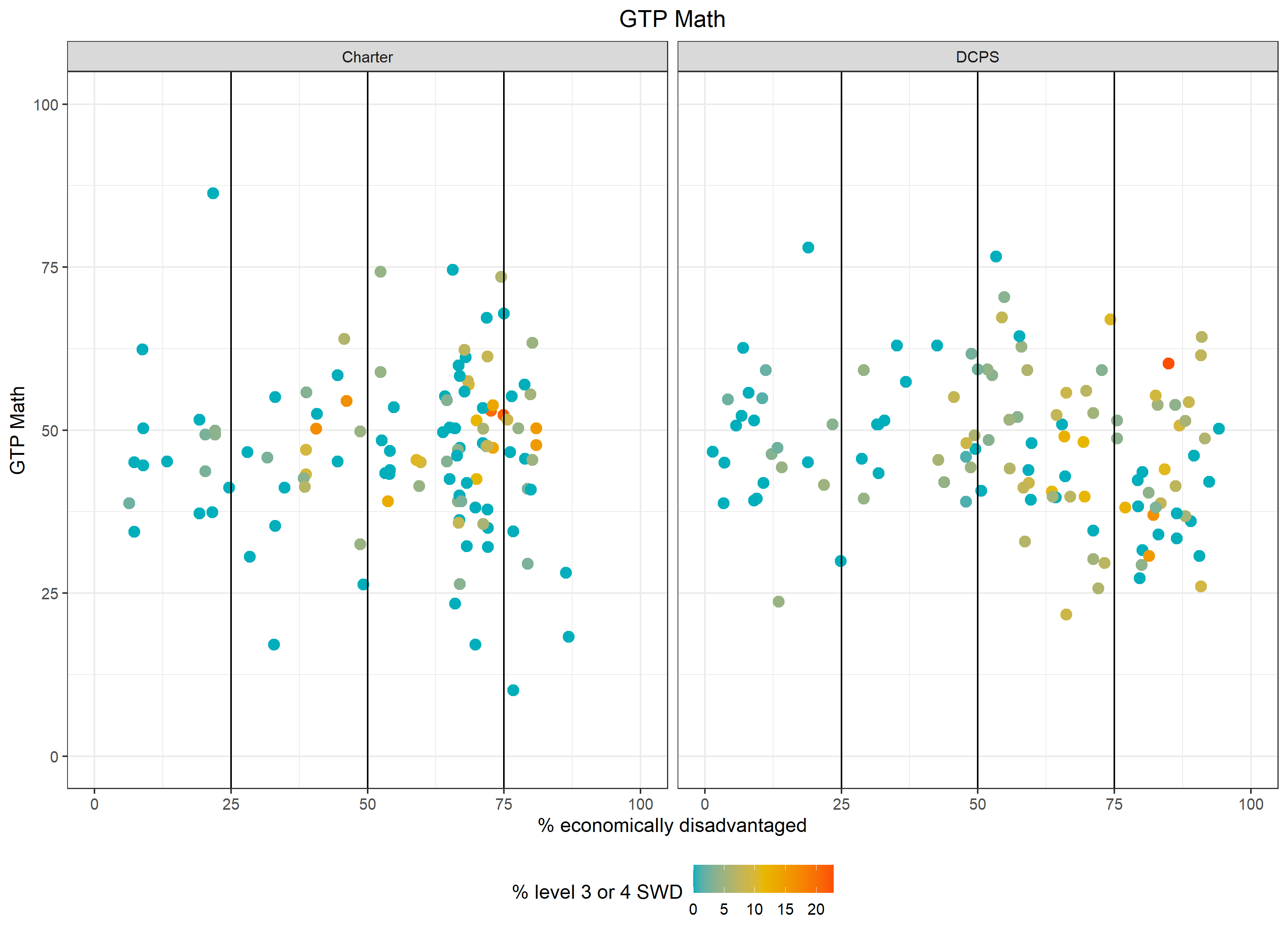
Growth: PARCC growth to proficiency (25% of school ratings in ES and MS and 12.5% in HS)
Another growth metric is to what extent students are getting closer to proficient in ELA and math. We see less of a relationship between % of economic disadvantage and these growth scores. However, OSSE uses proficiency subgroup data to calculate the majority of this metric, and the subgroup data are unreliable when the sample size in the subgroup is less than 100 students, which is true much of the time. Using subgroup data adds more error and can produce inaccurate and misleading metric scores. Moreover, OSSE uses subgroup data to calculate all of its metrics, which further increases the error.
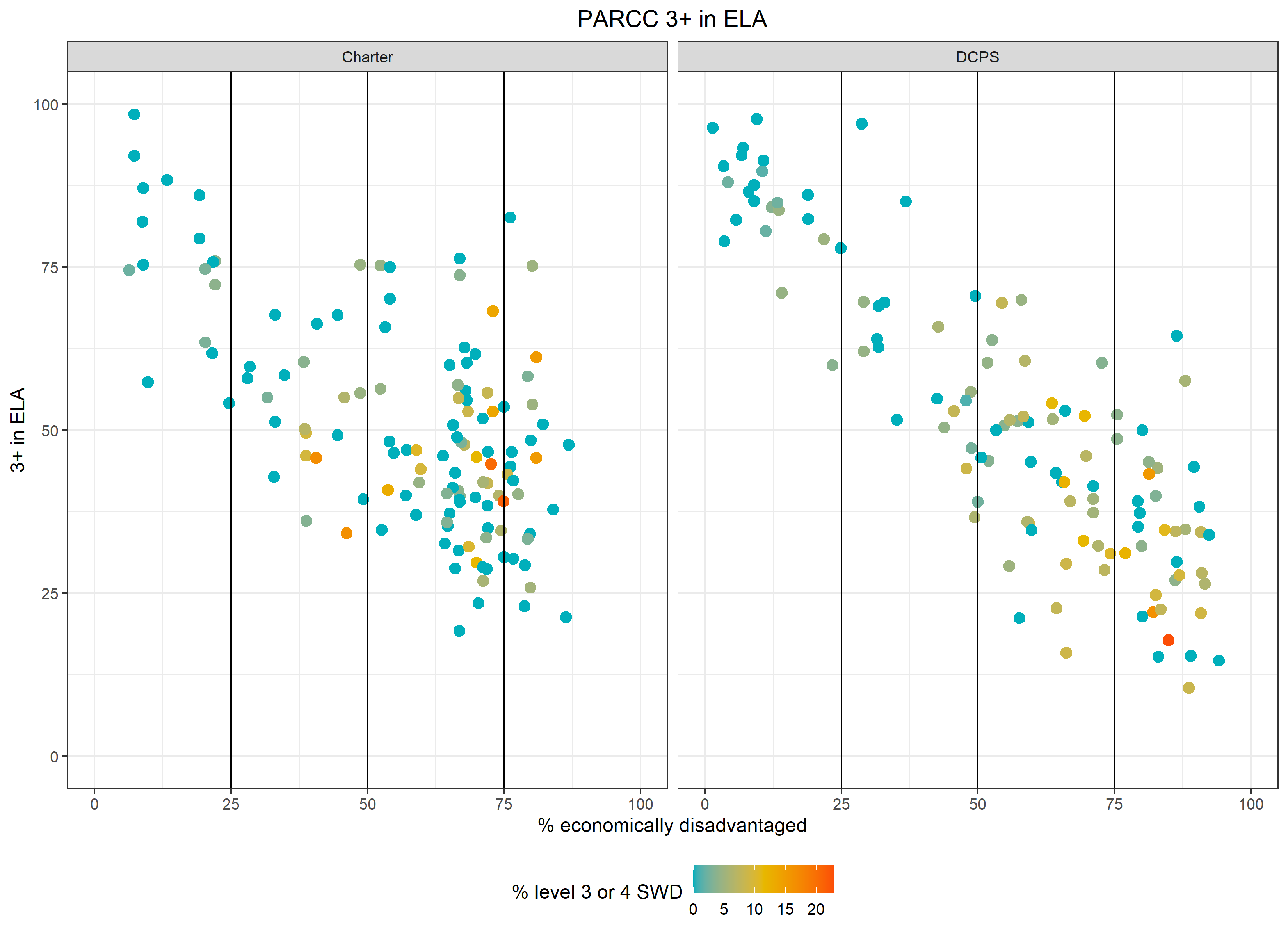
Test scores: PARCC proficiency and approaching proficiency (30% of school ratings in ES and MS and 25% in HS)
The relationship between the % economic disadvantage and test scores is the most pronounced because test scores (and proficiency rates) reflect cumulative educational opportunity since birth, and the US has a long history of income and racial inequality. To the extent that we give lower ratings to schools with lower proficiency rates, we give lower ratings to schools serving students with fewer educational opportunities since birth, with no regard for how much students learned while attending the school, at least not in this metric.


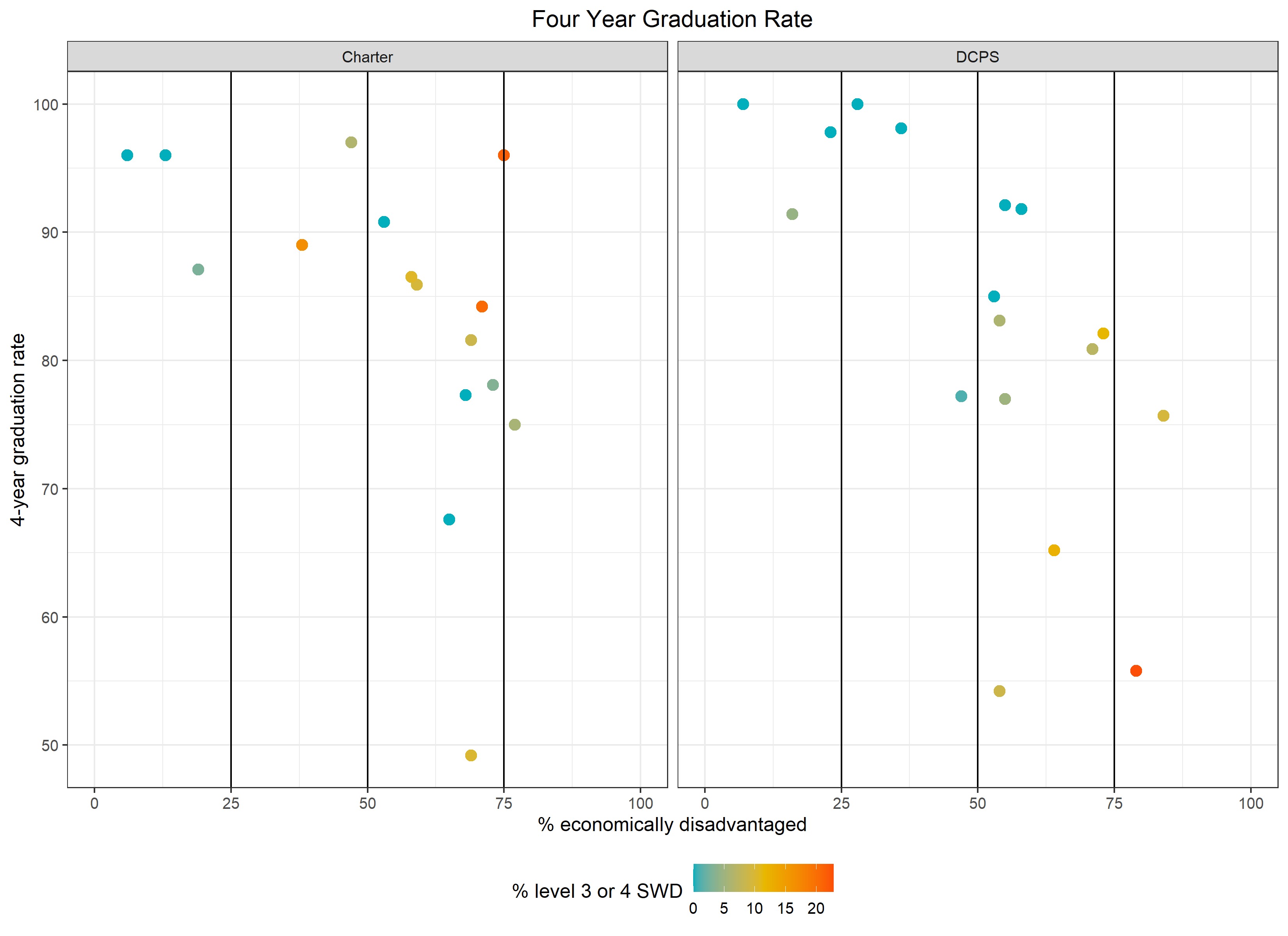
Graduation rates: Four and five year graduation rates (20% of school ratings in HS)
Similar to proficiency rates above, we see stark differences in graduation rates by % economic disadvantage for high schools. This metric essentially ignores all of the non-school factors that influence graduation rates and instead hold schools exclusively accountable for their graduation rates.

Putting it all together
Because most of the metrics have a relationship with student economic disadvantage to some degree, when we add up all the metrics, the overall school ratings also have a relationship with student economic disadvantage and other characteristics like special education needs. Student characteristics explain:
27% of the variation in school ratings in elementary school
21% of the variation in school ratings in middle school
61% of the variation in school ratings in high school
31% of the variation across all schools
And while this is an improvement over years past, it is still inequitable and unfairly rates schools with underserved student populations, particularly for DCPS schools with the most concentrated poverty. Moreover, it introduces another problem: more error in the ratings. Error in the ratings is exacerbated by unreliable growth metrics and calculating metric scores based on subgroups with small sample sizes. In other words, we can’t be sure the school rating accurately reflects the school’s performance in many cases. Instead, we get something like this:

One of the main points of education reformers is that we can’t lose sight out of the outcomes, even if students are coming from underserved backgrounds, and on this point, I agree. But education reformers would also argue that all of the changes needed to improve student outcomes and eliminate the effects of income inequality can happen at the school level without substantially more resources, and on this point, I disagree. Resolving income inequality at the school level would likely require enormous resources and sacrifices from the people currently benefitting from income inequality, if it’s even possible at all. When we hear about schools “leveling the playing field,” we don’t also hear “enormous resources” or “sacrifices” in the same sentence. When we say we care about equity but aren’t willing to give up anything for it, then we’re not really for equity.
And so we continue to give schools dealing with concentrated poverty systematically lower ratings because it doesn’t require anything of us. Better to pit the blame on schools and educators than face the inequity of the systems we have created and partake in.
Data notes:
The correlation between % economically disadvantaged and school ratings is: -0.47 for elementary schools, -0.45 for middle schools, and -0.76 for high schools.
In ES and MS, school ratings predominantly (80%) come from PARCC metrics based on grades 3-8 only. Because of this, I pulled student demographics from the PARCC data files for ES and MS as opposed to the demographics for the entire school.
In HS, 37.5% of school ratings come from PARCC metrics, 20% from graduation rates, 17.5% from AP participation and SAT college readiness, and 15% from metrics related to absenteeism. I pulled student demographics from the report card files for HS.
Other report card metrics below:
Re-enrollment (3-5% of ratings)
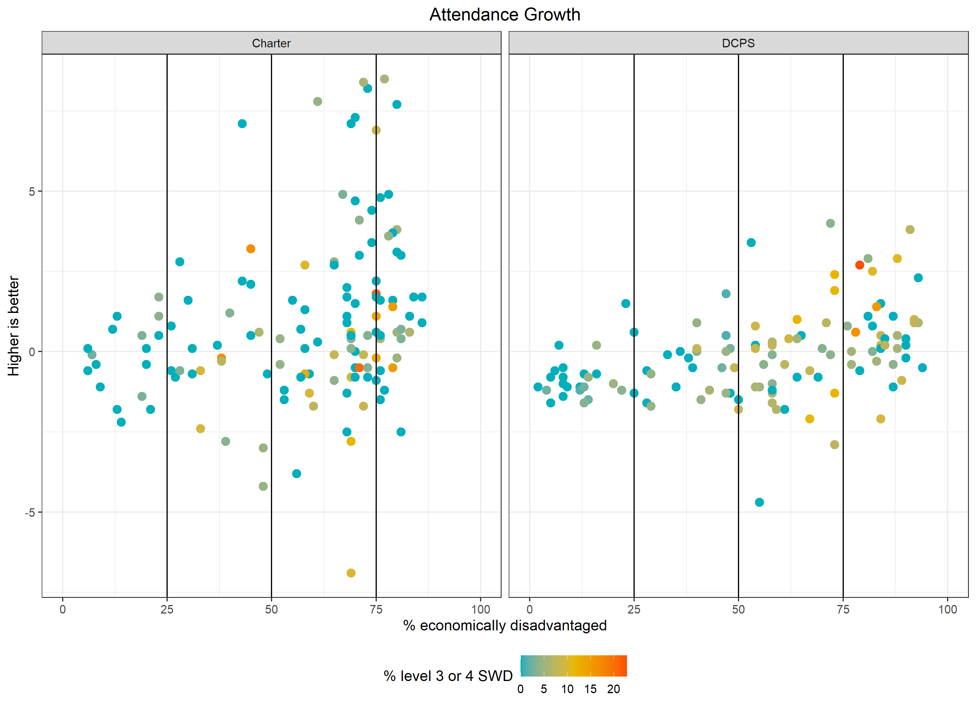
Attendance growth (4-7.5% of ratings)
Chronic absenteeism (4-7.5% of ratings) - NOTE THAT THIS APPEARS TO BE CODED THE WRONG WAY IN THAT SCHOOLS WITH HIGHER CHRONIC ABSENTEEISM HAVE HIGHER METRIC SCORES
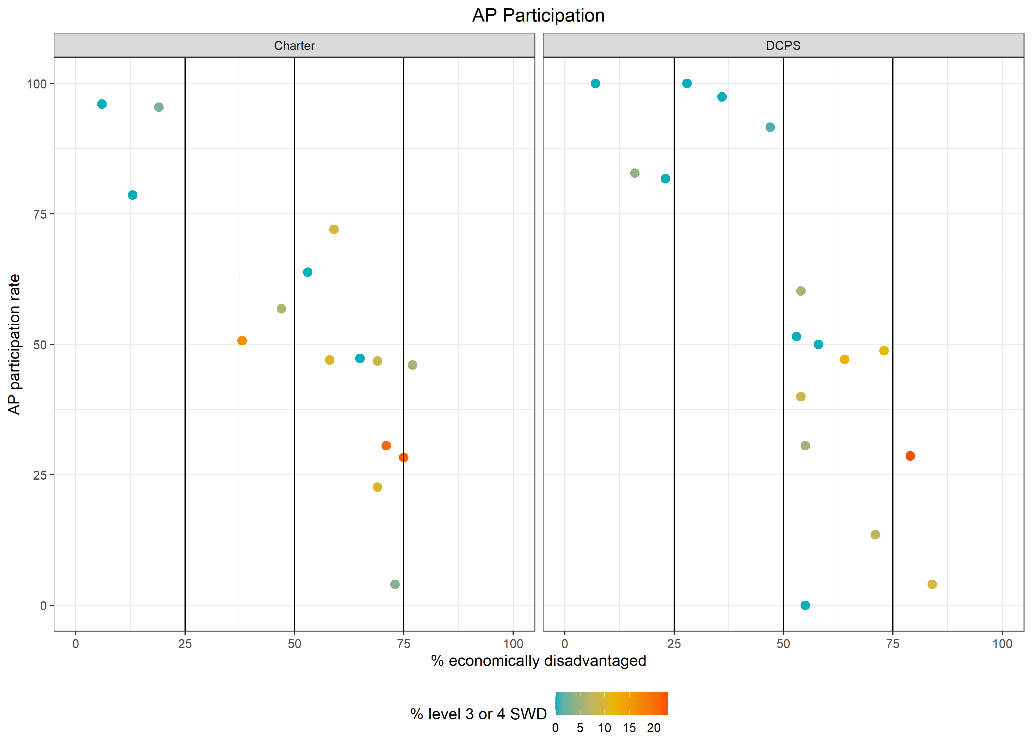
AP/IB/dual enrollment participation and performance (12.5% of ratings in HS)
SAT college ready (5% of ratings in HS)
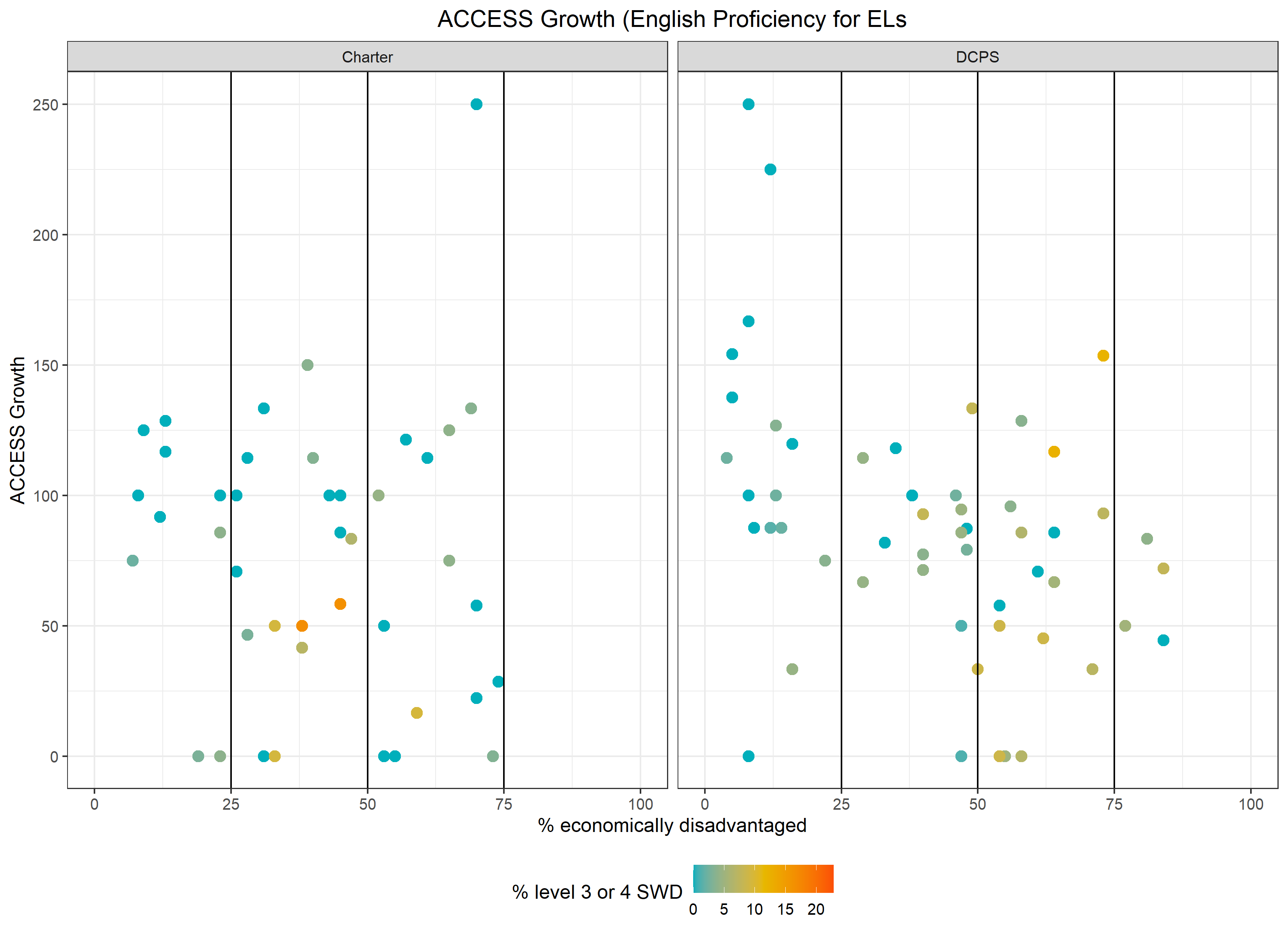
ACCESS growth for English learners (5% of ratings)
CLASS PK teacher performance (3% of ratings and not pictured below)